Overview
Templates can be configured by App Admins by accessing Apps from the Navigation Sidebar and opening the template – or – you can select View Template from the Action Menu (upper right corner) on any instance of a template.
Add/edit/remove template tabs via the tab management dialog in the action menu.
Templates can be edited in 2 distinct modes:
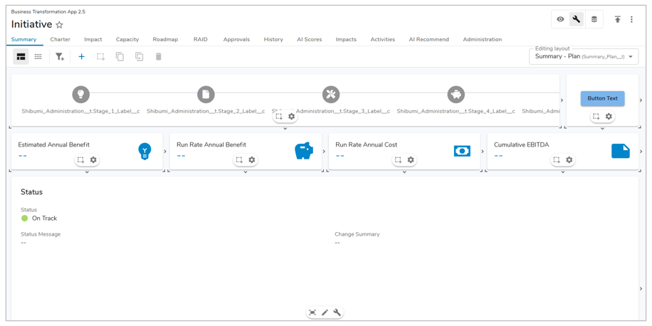
 Display: This mode allows you to view the layout in real-time, providing the ability to view the configured Layout without publishing. Press the ‘q’ key to enter Display mode.
 Configure: This mode allows you to configure the sections and layout, including adding columns, editing filters, defining section titles, adding sections, moving sections, etc. Press the ‘w’ key to enter Configure mode.
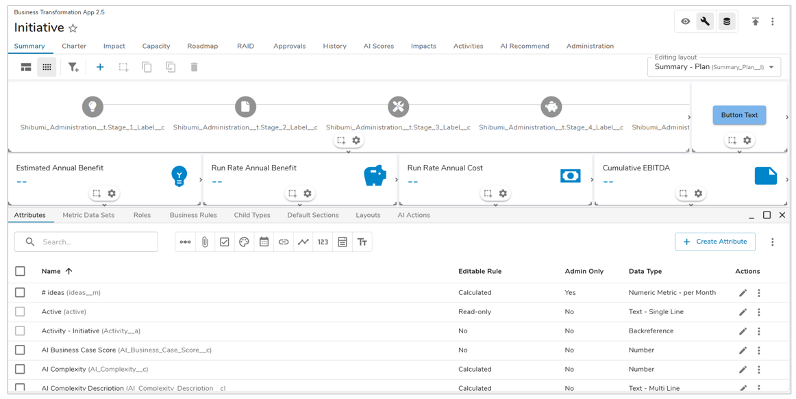
The Data Panel is a window that can be toggled on and off in either Display or Configure modes. This panel allows you to manage the data on a template, including attributes, data sets, business rules, roles, and child types. Press the ‘d’ key to toggle the Data Panel.

Configure Sections
While in configure mode, the section settings gear will provide access to customize the section and manage section settings.
Sections Overview
Sections are the building blocks in a template. They are the place where items can be created, viewed, and edited, and attributes can be defined.
- Table: display work items (i.e., instances of a template) or associations. Tables can be configured to include editing of data or creation of new work items.
- View: view and edit existing child items, metrics, participants; view audit history
- List: create and edit child items, metrics, attachments, legacy dashboards, presentations
- Export / Import: download an Excel file of child items and upload the edited file to make updates
- Create Form: creation of work items via a form
- Edit Form: display and edit fields on the current work item
- Card: high level insight into data within your solution
- Chart: display a dynamic, graphical representation of a defined value from within your solution
- Board: drag-and-drop items across columns to visualize and manage your work
- Alert: display dynamic alert content to convey important information
- Rich Text: include a section with formatted text
- Embed: point to a URL outside of Shibumi to be displayed in the section
- Image: display static, read-only text
- Visualizations* (may have a different name): include custom sections added by an App Admin
Rename a Section
Tables, Boards, Charts, Views/Lists, Forms, Embedded sections, and Export/Import sections can be renamed through the Rename Section dialog accessed by clicking on the settings gear in the Section Controls of the section while in Configure mode.
When no section title is present, the section header will be collapsed.
Enter text or an injected expression using the {!Attribute_API_Name__c} syntax to dynamically set the section title. Click Rename.
Design the Layout
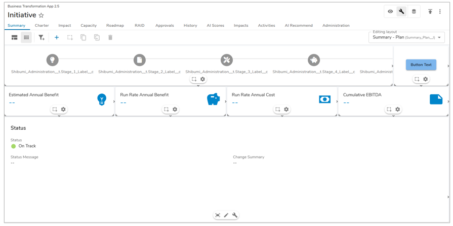
Toggle into Configure mode to view the Layout toolbar and modify the design of the Layout. While in Configure mode, each section will feature the floating Section Controls.
Floating Section Controls feature section-specific icons. The first icon provides the ability to change the height setting applied to the section. The second icon allows for renaming of the section. The customize icon is visible only on Edit Forms and Tables, providing the ability to enter text into the Form field’s or edit Table Columns. The final icon is the Section’s settings which will open the settings dialog.
Click and drag the bottom left or right corner of a section to resize length and width at the same time, or click and drag the sides of the section to resize length and width individually.
Reposition sections by clicking and dragging the section to the desired location. To select multiple sections simply use the ctrl/cmd and click on each section.
When one or more sections have been selected, the Layout toolbar allows you to do the following:
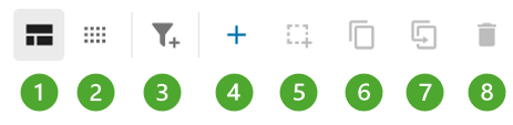
- Select Standard layout
- Select Condensed layout
- Add Filter
- Add a section
- Set a section’s height setting (currently auto-height)
- Duplicate a section
- Move a section to a different layout on the template
- Delete a section
Managing Layouts
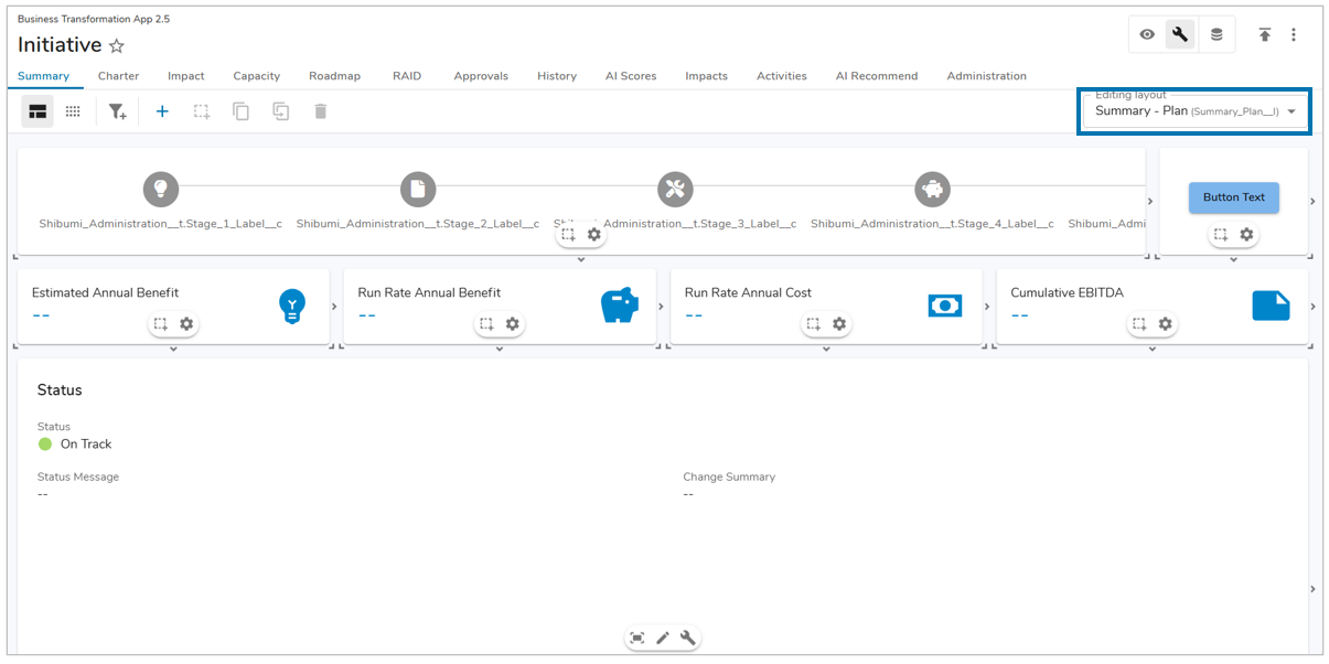
Each tab on a template can have one or more Layout associated to it. In Configure mode, on the right side of the toolbar there is a dropdown menu with the title Editing Layout. This Edit Layout dropdown shows the Layout that is currently being displayed on the tab.
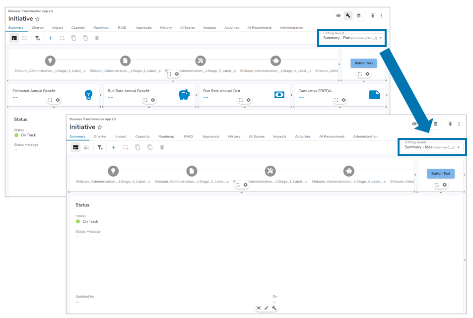
Each Layout on a tab is separate from one another, with each being dependent on a visibility expression set in the Configure Tab setting. Use the Editing Layout dropdown for seamless switching between multiple Layouts mapped to the tab, allowing for quick configuration of complex solutions. Please visit our Managing Tabs article for more information.
Note: If the Editing Layout dropdown is greyed out, then there is only one Layout defined for the current tab.
Standard Layout
The page is divided into a grid with padding around each section. Sections can be sized to any rectangular shape within the grid by using the sizing handles in the bottom left and bottom right corners or sides of each section.
Condensed Layout
The page is divided into a grid with thin boundaries around each section. Section sizing behaves the same way as the Standard layout. This format gives you the ability to fit the most content onto a page.
Add a Section
Click the plus button to open the Add Section dialog. Select a section type from the options on the left and add the section. 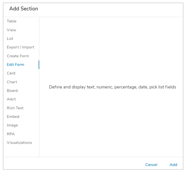
Height Settings
Sections can be set to Fixed height on a Layout, or they can grow to Fit to Content or Fit to Window. On the Layout toolbar with a section selected, choose the Height icon to the right of the Add Section button. The icon display and hover help will change based on the currently selected Height Setting.
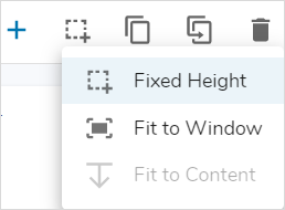
Fixed Height
The Fixed Height Setting option forces a section to remain at is designated size. While in Configure mode, you can set the height and width of a section by selecting a corner and dragging it to the preferred size. Selecting the Fixed height option ensures that the size of the section will not change. This option is available on all section types and acts as the default setting.
Fit to Window
The Fit to Window option allows a section to grow and shrink depending on the dimensions of the browser window. Selecting Fit to Window on a section will result in that section re-sizing itself in order to fill the remaining space of the window. By making the section expand to the remaining height of the window, it allows for greater UX control and optimization across browser/screen sizes. When a section is set to Fit to Window, the Fit to Window icon will be displayed at the bottom of the section when in Configure mode.
Note:
- To avoid extra scrolling behavior, do not put another section under one that’s Fit to Window. Additionally, don’t do this on presentation slides as it will have undesirable behavior when publishing.
- The Fit to Window setting is best not used on a Tab with Discussions.
Fit to Content
The Fit to Content option allows a section to grow and shrink depending on content. The height of a section within a Layout will be the minimum height of the section. As content grows, the section grows. If content shrinks (or is filtered down, toggled to a different view, etc.), the section will shrink, but it will not get smaller than the minimum height defined on the Layout. This option is not available on Tables.
When a section is set to Fit to Content, the Fit to Content icon will be displayed at the bottom of the section when in Configure mode.
Manage Data
Toggle into Data Panel to access the template Data. Here you can add attributes, metrics and business rules, configure data sets, roles, and child types.
The Child Types tab allows you to configure a parent-child relationship between templates, which defines the solution hierarchy. Only templates defined as Child Types will appear as available Create Forms and Lists in the Add Section dialog in Configure mode.
Learn more about template data management here:
- Creating attributes
- Managing data sets
- Configuring roles
- Business rules
- Child Types
- Default Sections
- Layouts
- AI Actions
Publish Template
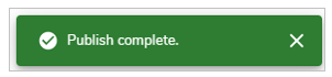
Once you have completed your modifications, click on the Publish icon to make the modifications available to end users.

Upon successful publish, the Success alert will appear in the bottom right of the page.
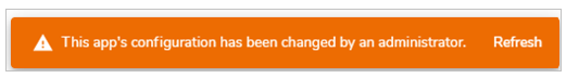
Users currently on an instance of the published template will see an alert that the App has been modified and a refresh is required to continue working.