
Overview
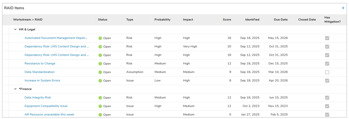
The Table section is an extremely performant display of work items (i.e., instances of a template) or associations. Tables can be configured to include editing of data or creation of new work items.
Tables will be paginated when they’re set to Fixed Height and will have virtual scrolling when they’re Fit to Window (default), more information on these settings can be found in the Height Settings article. Tables can also be configured to show a single line-height of data, or 2, 3, or 4 line-height for each row.
Adding a Table
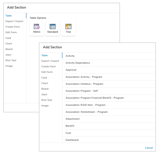
- On a layout in Configure mode, open the Add Section dialog.
- Select the Table option from the left panel.
- Choose the Standard icon from the Table Options.
- Click on the desired template or association to define the content to be displayed in the Table section. The Table will be added to the layout.
Configuring Table Settings
After successfully creating a new Table Section, follow the steps below to fully configure your new Table. These configuration options can be edited on an existing Table Section via the Settings dialog while in Configure mode on a Layout.
General Tab
- Click on the Settings icon (gear) from the Section Controls of the Table.
- Click on the Sources drop down menu to see all available templates. Select one or more templates or associations.
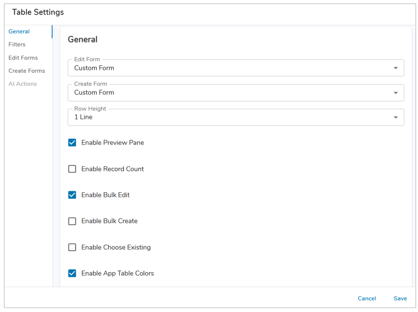
- Edit Form: This setting enables single-line editing via a Form dialog. Choose between the Default and Custom Form choices via the drop-down menu, or Disable the Edit Form. Selecting Custom Form will enable the Edit Forms tab of this dialog, allowing you to customize a Form for editing.
- Create Form: (Optional) Enable Create from Table by selecting an option from the drop-down menu. This will display a plus button on the Table so users can add new work items. Choose between the Default and Custom Form choices. Selecting Custom Form will enable the Create Forms tab of this dialog, allowing you to customize a Form for editing.
- Row Height: Define the Row Height for the Work Items being displayed in the Table, choose from 1-4 Lines. This will apply to all rows in the Table consistently.
- Record Count: (Optional) Enable or disable the Record Count, which displays the total number of records displayed on the Table in the bottom right of the section.
- Preview Pane: (Optional) Enable or disable the Preview Pane to allow users to preview work items in the Table.
- Bulk Edit: (Optional) Enable or disable Bulk Editing for the Table. Ideally, Bulk Editing should only be enabled on Tables that have been optimized for bulk edit. For example, Calculated and Attachment Attributes cannot be bulk edited making their inclusion in Bulk Edit-enabled Tables unnecessary. Additionally, Table columns that are grouped will become individual columns in the Bulk Edit Dialog which could impact the size of flexible-width columns. It is recommended to use fixed-width columns to ensure there’s enough space for editing the content.
- Bulk Create: (Optional – only available if Create Forms are enabled) Enable or disable Bulk Creating from the Table. The Bulk Create dialog will leverage any fields configured for the work item’s Create Form on the Table configuration.
- Choose Existing: (Optional – only available on Association Tables) Enable Choose Existing in an Association Table to include the ability to associate to an existing work item from the Association Table.
- App Table Colors: (Optional) Enable App Table Colors for the Table. The columns will have their respective colors applied from those configured on the App Colors page. For more information regarding Table Colors, please review the Configuring App Colors article.
Filters Tab
The Filters Tab on a Table Settings dialog provides the ability to configure locked filters, which can either filter on fixed values or be tied to Page Filters. Additionally, a limit of the number of items displayed on a Table can be set via the Limit section.
Locked filters can be set when configuring a Table. These filters will apply to all content in the Table and cannot be seen or edited by end users viewing the Table.
Ex: {!toFilter(today())}, {!toFilter(Program__t.Start_Date__c)}
Additionally, Page filters can be set using the injected expression syntax: {!toFilter(API_Name__f)}. Refer to the Page Filtering article for more details on configuration.
- Navigate to the Filters tab in the Table settings dialog.
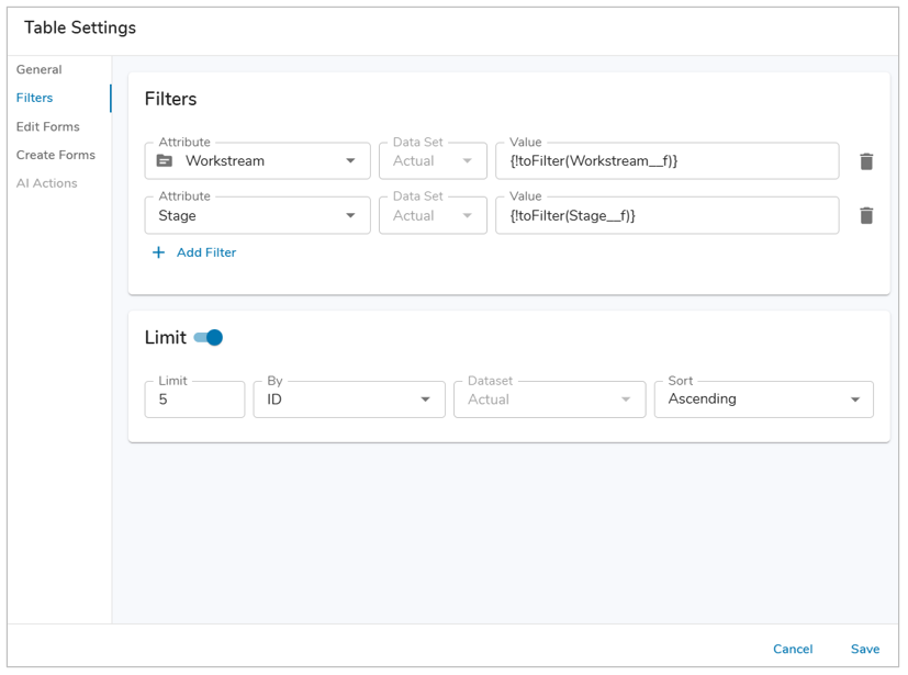
- Choose the attribute on which to filter from the drop-down menu.
- Enter a value into the Value field. Filtering syntax can be found here.
- Add another filter by clicking Add Filter.
- Remove a filter by clicking the trash icon next to the filter.
To set a limit on the number of work items displayed in a Table section, toggle on the ‘Limits’ section on the Filter tab.
- In the Limit field, define the maximum number of work items that can be displayed in the Table section.
- Choose from the available Attributes to filter on and their data set (if applicable).
- Finally, define whether the sort order is Ascending or Descending.
- Save and Publish your changes.
Note: Limits are enforced after alll other filters, including Page Filters.
Edit Forms Tab
Table Sections support quick editing via the use of an Edit Form.
- To enable the Edit Forms tab, select Custom Form from the Edit Form dropdown on the General tab.
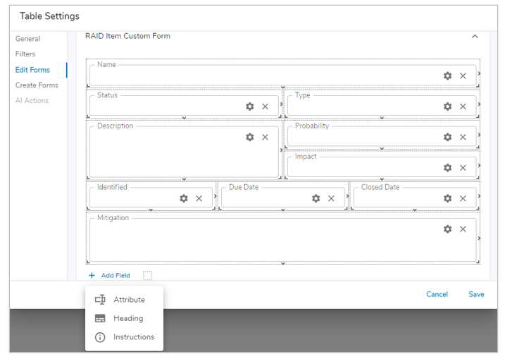
- Navigate to the Edit Forms tab to configure a custom edit form. Forms can be configured for each Type included in the Table. See Managing Forms for full configuration options. Once configured to your liking, click Save.
- With an Edit Form configured, you can now edit each Type via the edit icon in the far left column of the Table Section.
Notes:
- Switching between Custom and Default Forms will erase any Custom Forms upon saving.
- Disabling Edit Forms will erase any Custom Forms upon saving.
Create Forms Tab
Tables support creation of new work items via Create Forms.
- To enable the Create Forms tab, select Custom Form in the Create Form dropdown on the General Tab.
- Navigate to the Create Forms tab to configure a custom edit form. Forms can be configured for each Type included in the Table. See Managing Forms for full configuration options. Once configured to your liking, click Save.
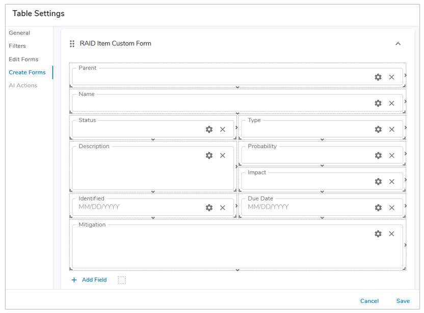
- With a Create Form configured, you can now create new work items via the plus button in the top-right of the Table Section.
When Create Forms are enabled on a Table, App Admins can utilize this feature to seed descendant content on the Template. However, when seeding content on a template, you cannot define values in association attributes.
Notes:
- The order of Create Forms can be changed by using the grabber icons on the header for each form.
- Metric columns cannot be included in Create Forms. Additionally, non-editable out-of-the-box attribute columns will not appear in the default Create Form.
- Switching between Custom and Default Forms will erase Custom Forms upon saving.
- Disabling Create Forms will erase Custom Forms upon saving.
- A warning will appear when enabling Create Forms on Association Tables if the association is calculated.
For information on Creating from Tables on an instance, please visit our Utilizing Table Sections article.
AI Actions Tab
The AI Actions tab supports the configuration of the AI: Recommend Content for the Table Section. Selecting the tab will provide a drop down to choose from a configured AI Action. For more information, please visit our AI Actions support article.
Note: The AI Actions tab will only be active if an action has been configured for the template type selected for the Table.