
Overview
The Card section allows for quick visual insight into the data within your solution. Card sections can display a single value or multiple values from your solution as well as a Progress Bar derived from a value as a visual aid. Values consist of attribute data from the current template, the aggregation of attribute data from child templates, the count of specific child work items (i.e., instances of specified template types), or a calculation of two values configured on the Card. Cards can be designed to dynamically respond to page filtering and can include the Drill Down capability to provide better insight into the data being presented.
These 5 fields can be included on Card sections to display key information to users, all fields are optional except for the Value:
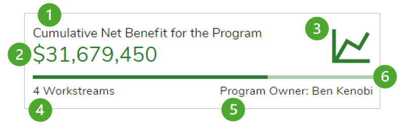
- Label: Text field typically used as the title for the Card, accepts plain text or injected expression.
- Value: Displays data from a template in the form of Attribute, Attribute Aggregation or Record Count. Supports multiple values (see below).
- Icon: Displays an icon in the top right of the Card, choose from the icon list provided.
- Left Caption: Provides additional supporting information for the Card, choose from text/injected expression or a configured Value. Hover text is available when content is truncated.
- Right Caption: Provides additional supporting information for the Card, choose from text/injected expression or a configured Value. Hover text is available when content in truncated.
- Progress Bar: Visually depict percentage achieved against a target.
Adding a Card
- On a layout in Configure mode, open the Add Section dialog.
- Select the Card option from the left panel.
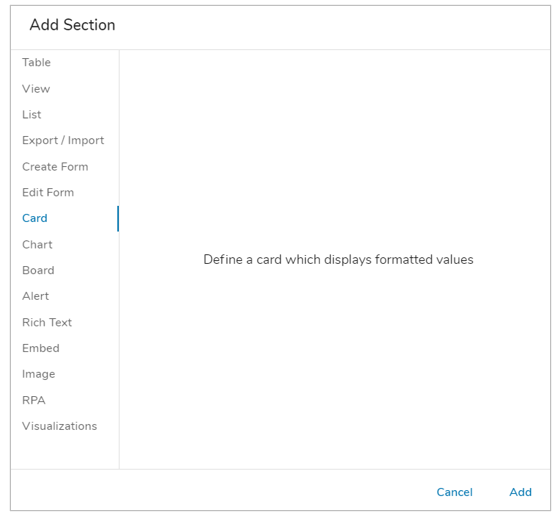
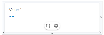
- Click on the ‘Add’ button. The new Card section will appear on the layout, defaulting to ‘Value 1’.
Configuring a Card
Value Tab
On the Value tab, you define the value(s) to display in the Card section.
- Click on the Settings icon (gear) on the Section Controls of the Card section. The Settings dialog will open to the Value tab.
- One or more Values can be configured for display in the section. Additional Values can be added by selecting ‘Add Value’. Values can also be duplicated and deleted.
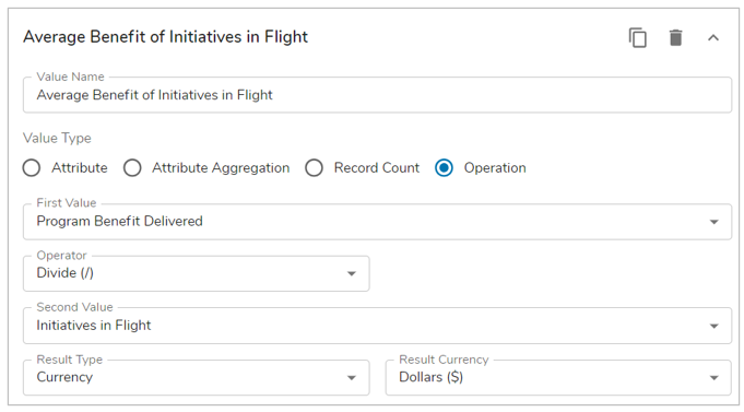
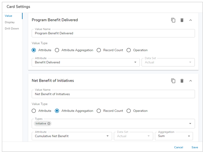 Define a Value Name. Value Name is required when creating a value. The first Value Name will be used as the default Label for a card. Note: The Label for a Card can be updated to be manually entered.
- Next, define the Value Type. There are four options available for selection:
- Attribute: Select an Attribute or Metric from the current template. If a Metric is selected, enter an expression to define the timeframe.
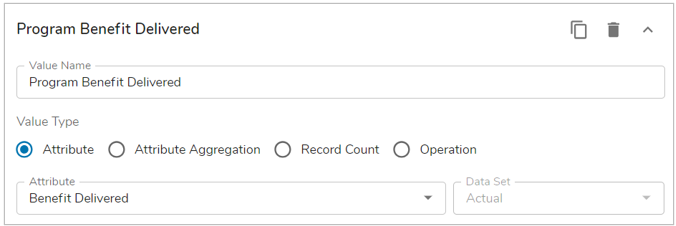
- Attribute Aggregation: Aggregate attribute/metric values from the specified child or associated template type(s). Select the Attribute (Number, Name/Value Pick List, Name/Value/Icon Pick List) or Metric and the Aggregation Type (Sum, Average, Median, Minimum, Maximum) from the drop-down menus.
- Note: Only the Numeric Value from the Pick List will be displayed on the Card section. The Name and value will be displayed in the Drill Down if enabled.
- Note: Only the Numeric Value from the Pick List will be displayed on the Card section. The Name and value will be displayed in the Drill Down if enabled.
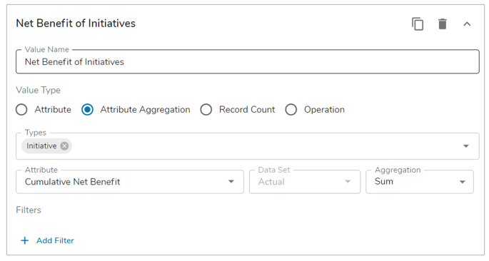
- Record Count: Counts the total number of instances for the specified child or associated template type(s).
- Operation: Performs a calculation on two Values, whether they are Values previously configured on the Card, a static value, or a combination of the two. Choose from Adding (+), Subtracting (-), Multiplying (x), or Dividing (/) the two Values. The Result can be displayed as a Number, Percentage or Currency.
- Note: Drill Down is not available on Card sections utilizing the value type Operation.
- Note: Drill Down is not available on Card sections utilizing the value type Operation.
- Attribute: Select an Attribute or Metric from the current template. If a Metric is selected, enter an expression to define the timeframe.
- From the Types drop down menu, select the desired template(s) or association(s) to define what values will be available to display in the Card section. This is only applicable to Attribute Aggregation and Record Count.
- If the Value Type selected was ‘Attribute Aggregation’ then you will need to select an attribute from the drop down. See previous step 4 for more details.
- (Optional) Add one or more Filters. Select an attribute to filter by from the Attribute dropdown, select the Data Set to use for the attribute and enter a Value in the text box. A Page filter can be referenced in the filter value field using the {!toFilter(Filter_API_name__f)} expression. If a Data Set Page Filter is configured, it can be selected as an option for the attribute’s data set.
Value Tab – Displaying Metric Values
There are additional configuration capabilities to leverage in conjunction with page filters when display metric values on Cards.
- From the Card settings dialog, select the Attribute or Attribute Aggregation option for the Value Type. For Attribute Aggregation, select the Template Type.
- Next, select the Attribute drop down and choose a Metric data set.
- Select a configured Data Set filter to seamlessly pivot between different data sets without having to configure separate Card sections for each.
- E.g., On a template, add a Data Set page filter. For simplicity, lets say you name the page filter: Data Set, API Name: Data_Set__f. Now, when configuring the Card section you will notice additional options within the Data Set dropdown.
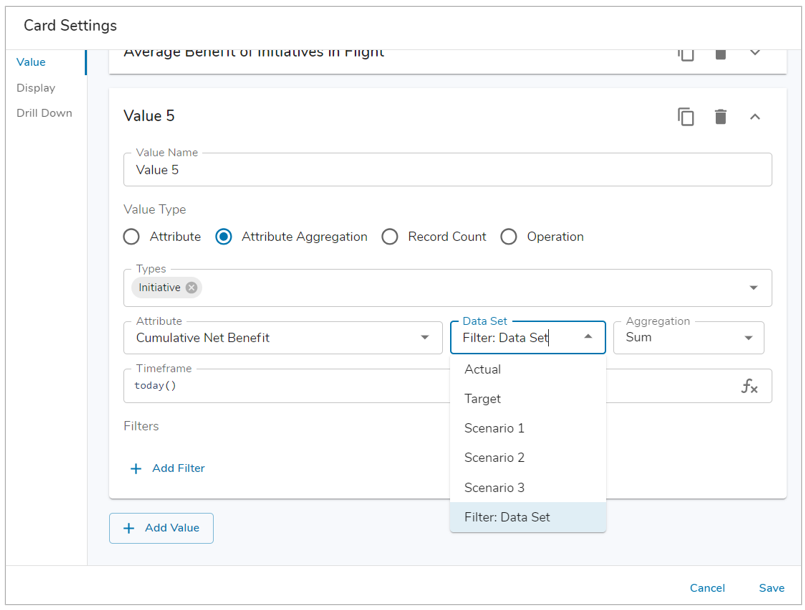
- Selecting the Filter: Data Set option will allow the page filter to define the data set value you’re displaying and will respond as such on the instance in real-time.
- When a Metric is selected, the Timeframe Date field will appear on the dialog with the default of “today()”. Enter a custom timeframe to display using the Shibumi Expression Language.
- E.g., Entering addMonths(today(),-6) for a monthly metric will display the metric value from 6 months ago.
- Cards can reference Date and Date Range page filters within the Timeframe Date field. This allows you to dynamically define the timeframes for the metric data sets to quickly switch between dates displayed, the Card data will immediately update as filters are changed.
- Finish configuring the Card as desired, Save and Publish.
Display Tab
The Display tab allows you to configure the Label, Layout, Icon and Colors for your Card.
-
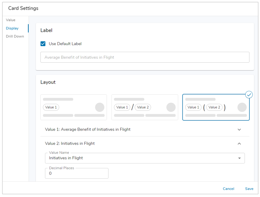 A Label will be displayed above the Value(s) on the Card section. By default, the Label will be derived from the first Value name created. To customize the Label de-select the checkbox. Within the field, enter static text or use the injected expression syntax to define a dynamic Label.
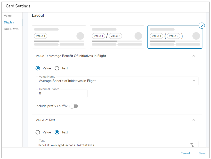 Choose a Layout for the Card section. Depending on the layout selected, you will see Value 1 and/or Value 2 sections. You can define whether the Value will display a configured Value or a Text Value, this Text Value can be literal text or leverage injected expressions. If Value is selected, select the Value(s) (configured on the Value tab) to be displayed. The number of decimal places can be updated and a prefix/suffix can be configured. The layout options for the Card are as follows:
- Value 1
- Value 1 / Value 2
- Value 1 (Value 2)
- (Optional) Define a Progress Bar for visual representation of a percentage on the Card section. The selected Value for the Progress Bar must be derived from either an Operation Value that is set as a Percentage, or an Attribute Value that is referencing a Number with the Percent Data Type or a Metric attribute with the Percentage Unit of Measure.
- (Optional) Define a Left/Right Caption to display supplemental information on the Card section. Captions have three display options when configuring them:
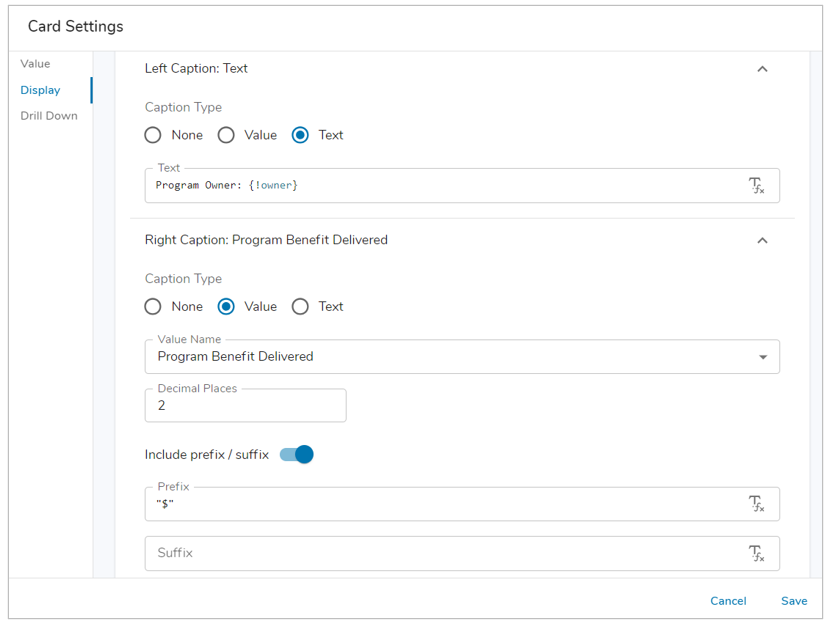
- None: Default option.
- Value: Utilize a Value defined on the Value Tab to display data, the decimal places and prefix/suffix can be defined for each caption using the Value option.
- Text: Enter literal text or an injected expression to provide additional information on the Card.
- (Optional) Select an Icon. Type-ahead is available to search the icon list.
- Note: A Card can have no Icon (default) by selecting the ‘X’ in the field.
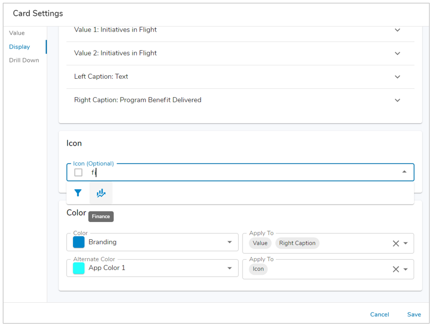
- Note: A Card can have no Icon (default) by selecting the ‘X’ in the field.
- Define the Color and Alternate Color for the Card section. Choose where to apply each color to: Value, Icon, Left Caption and Right Caption via the drop-down menu. The color options available are based on your Enterprise Theme colors set in Enterprise Administration or any defined App Colors.
- Note: If one of the options is not defined for the Color or Alternate Color, then it will use the default black.
- Save. Publish your changes if on a template.
Conditional Colors on Cards
Configuring conditional colors on a Card section is done using the Color dropdown in the Color section. The colors can be derived from a Metric or Number Attribute using the data set’s conditional formatting or a Custom condition based on Values configured on the Card.
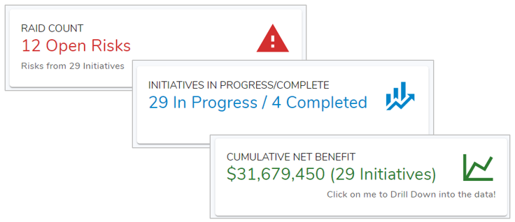
For example, a Card displaying RAID Item information on an Initiative could be colored Green if there are <=5 RAID items for the Initiative, Amber if there are <=10 RAID items for the Initiative, else use Red.
On a Card Settings dialog, on the Display tab, navigate to the Formatting section. Using the Color drop down menu, choose the Conditional option. Two options will be available:
Default: Only Values configured on the Card which consists of a Metric or Number Attribute with conditional formatting enabled are displayed. 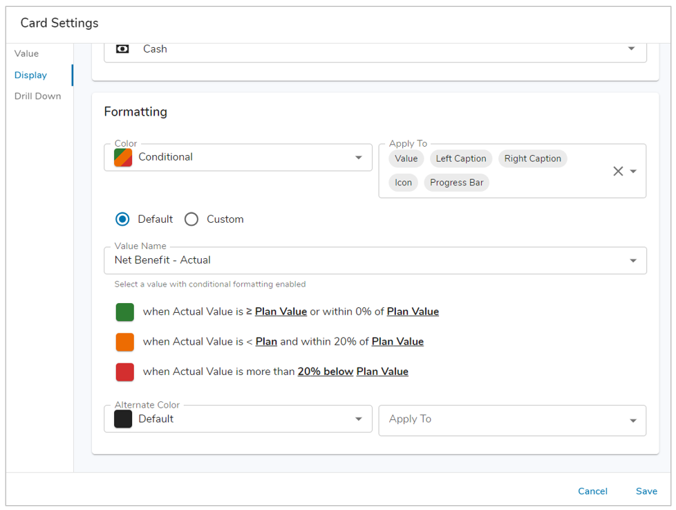
- With the Default option selected, open the Value Name drop down menu.
- Choose an available Value.
- Review the conditions for the Success, Warning, and Error colors. Save.
Custom: Any Value configured on a Card can be selected for custom conditional formatting. The color is defined per condition, using the same color options available on your Enterprise Theme colors set in Enterprise Administration and any defined App Colors. 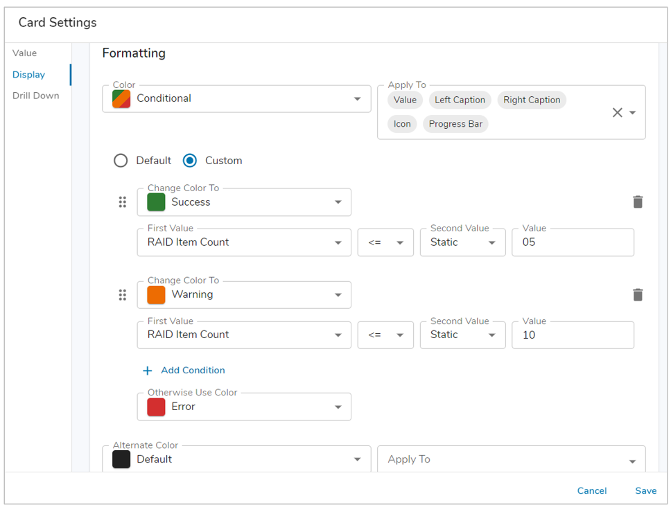
- With the Custom option selected, select a color from the Change Color To drop down for the first condition.
- Select the First Value from the available list of Values configured on the Card, then set the operator (>, <, =, etc.).
- For the Second Value, you will choose another Value configured on the Card section or a Static value.
- (If Static Value) Enter a number into the field that appears to the right.
- Configure any additional conditions by selecting the ‘+ Add Condition’ button as needed.
- Finally, set the Otherwise Use Color field to a color. This color will be displayed when no other conditions are met.
- Review your conditions and Save.
Note: You can delete conditions by selecting the trash icon, you can also re-order conditions by selecting and dragging the grabber icon for the respective condition. Like Alert sections, conditional formatting on Cards runs until the first successful condition is met.
Drill Down
The Drill Down tab allows you to enable or disable drill down for the Card section. When enabled, you can configure additional columns to display in the dialog as well as define groupings of the aggregated data.
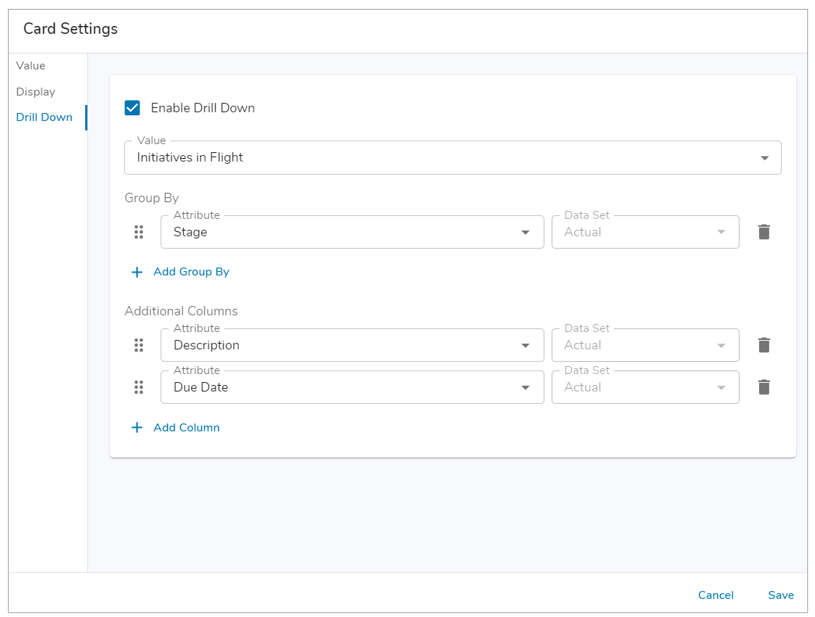
- Select the checkbox to enable drill down for the Card section.
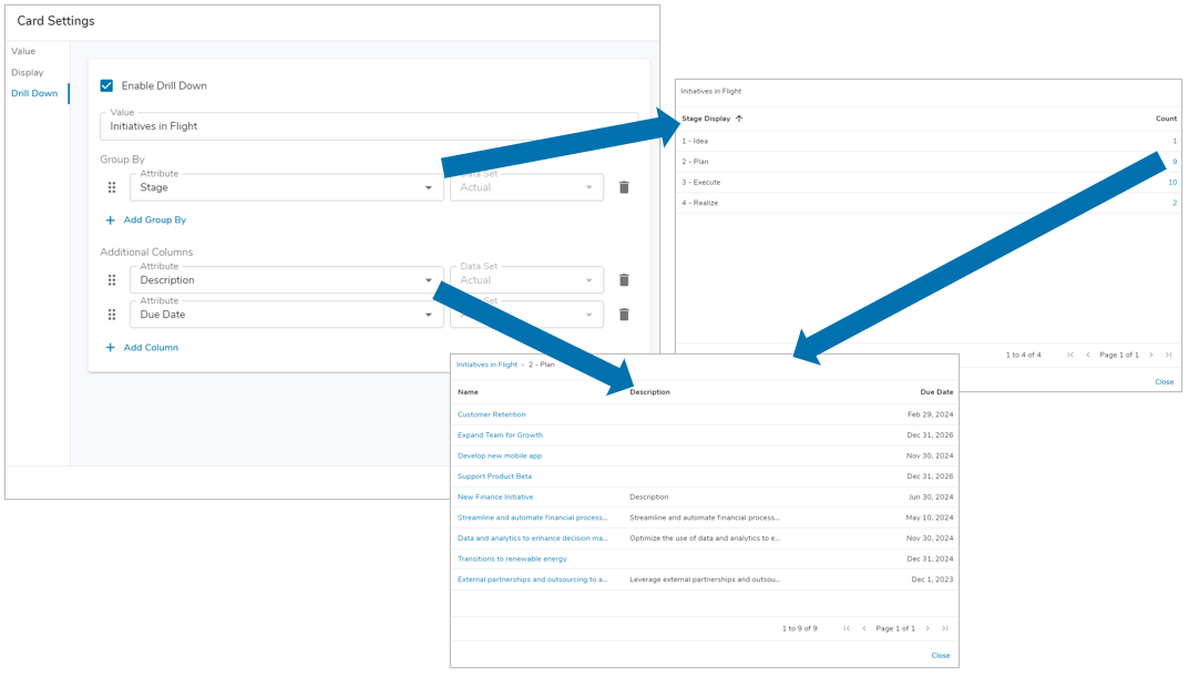
- With drill down enabled, choose from one of the configured Values (from the Value Tab) to use for drill down. Users will be able to click on the value displayed on the card to see the list of work items contributing to the value. The work items are hyperlinked. Users can click the link to open a work item in a new browser tab.
- Note: Drill down on a Card is not possible when the Value is from the current work item.
- Add additional columns of information to the Drill Down dialog by selecting the ‘+ Add Column’ button. The attribute options available for selection as columns will be derived from the Template Type for the selected Value.
- Save and Publish your changes if on a template.
Note: Hover Text is available for all Drill Down dialog columns.
Group By
An additional feature available with Drill Down is the Group By capability. This capability shows progressively more granular aggregations of data and ultimately provides users with the ability to click the work item hyperlink to see it in a new browser tab.
For example, with a Program that includes initiatives that each contain a Benefit value, imagine a Card section at the Program level displaying a sum of Initiative Benefit values. With drill down, but without Group By, when the user clicks on the card, the user would see the list of Initiatives and the Benefit value each initiative contributes to the card’s display value.
With Group By defined to group the values by Benefit Type, rather than immediately seeing all of the Initiatives and their Benefit values, a click on the Program level card would show a grouped drill down displaying the values aggregated by Benefit Type. The value on the grouped drill down is hyperlinked to allow for a next level drill down. A click on that link would show the list of Initiatives contributing to the grouped value.
- When Drill Down is enabled, the Group By feature will become selectable. Select the ‘Add Group By’ option.
- From the Group By drop-down, select the attribute by which you want to group the card’s data.
- Optionally add additional Group By attributes. Each group will cascade to the next to show progressively more granular aggregations.
- Save. Publish your changes if on a template.
Notes:
- The attributes that have been selected in Group By have the ability to have the order changed. User the drag and drop next to the attributes to re-order them. Any attribute can also be removed by selecting the trash icon.
- The breadcrumb trail at the top of the dialog provides an easy way to navigate to different levels of your grouped data.