
This is a Beta Release feature. Configuration and functionality may be modified before formal release.
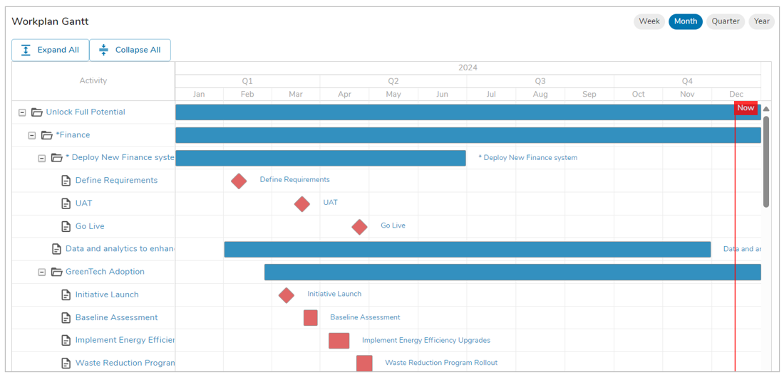
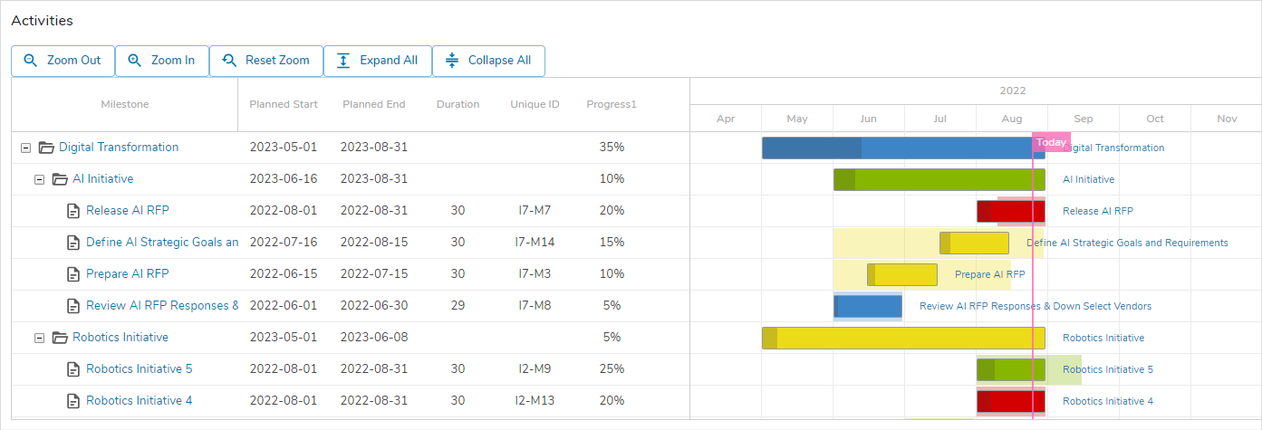
The Workplan Gantt Chart section provides a dynamic Gantt chart that allows configurability beyond that provided by the Gantt visualization toggle available with Shibumi lists and views.
The display of the Gantt Chart is configurable when the section is added to a template, dashboard, or presentation. With the Workplan Gantt, in addition to visually depicting the milestones and durations of tasks, you can:
- Adjust item dates or percentage complete values directly from the Gantt
- Display/add/remove dependencies between items on the Gantt
- Open the preview pane to view and edit additional detail about the item
- Add additional items (e.g., milestones, activities) directly from the Gantt
How to Use
Adjust the chart display using the control options available above the Gantt.
- Expand All – expands any currently grouped items
- Collapse All – collapses any currently expanded groups
Adjust task dates by hovering over the left or right edges of the task bar until a cursor arrow is displayed. Drag the edge of the bar to the desired date.
Adjust milestone dates by hovering over the milestone diamond until you have the crosshair cursor and then click and drag the milestone diamond to the desired date.
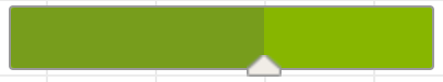
Adjust percentage completed for a task by hovering over the task bar until the percentage complete caret is displayed along the edge. Click on the caret and drag left or right to define percentage complete. The completed portion of the task is shaded darker than the uncompleted portion.
If configured to support dependencies, define predecessor and successor dependencies by hovering over the predecessor task until you have dependency circles displayed to the left and right of the task or milestone. E.g., to define a finish- to-start dependency, drag from the right-side circle of the predecessor to the left-side circle of the successor task.
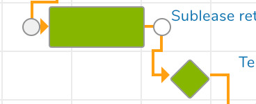
Delete a dependency by double-clicking on the dependency line. A confirmation prompt will be displayed. Click Delete to confirm.
To open the preview pane for an item, either hover over the item columns until the cursor is displayed as a magnifying glass and then click to open the preview pane, or click directly on the task bar or milestone diamond. From the preview pane, you can review and update the item data.
Open the work item by clicking on the hyper-linked name of the work item which is displayed as a label next to the task or milestone and/or displayed as a column on the left side of the Gantt.
If configured to support adding new items, add new items directly on the Gantt by clicking the plus button that is displayed to the far right when you highlight the columns for an item. The Add Item window will be displayed. Enter values in the fields and click Create. The item will be added as a new row on the Gantt chart.
How to Configure
To include a Workplan Gantt Chart section in your solution:
- On a layout, dashboard or presentation, from Configure mode, click Add Section.
- Select the Category of the Workplan Gantt Chart section (this is configurable but is typically: Visualizations).
- Click on the Workplan Gantt Chart option to add it to the layout.
- Note: You cannot set a custom section to auto-height. You must size the Workplan Gantt Chart to a static height and will be able to scroll within the section to see content.
- Click on the Settings gear in the top right corner of the section to open the Settings dialog.
- Modify the settings to define the behavior of the Workplan Gantt Chart.
Section
This section defines the title for the Gantt Chart and allows you to specify a Filter section that will be applied to the Gantt content.
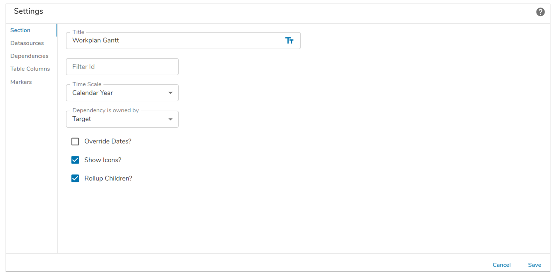
- Title: A section title is optional. If there is no title, the Gantt Chart contents will fill the full section real estate. Toggle between a text value or an expression resulting in the title by clicking on the text/expression icon at the right of the field.
- Filter Id. This setting is optional. If a Filter section is included on the same managed layout (i.e., tab, dashboard, or presentation), the Workplan Gantt Chart can reference the Filter section. Any values entered on the filter section can be applied to the Gantt content. If a Filter section is not included, the Workplan Gantt can be filtered by referencing page filters.
- Time Scale: The time scale option allows for the defining of the Workplan Gantt Chart’s span. From the drop down menu, you can select either Calendar Year or the Fiscal Year. The Fiscal Year is defined within your Enterprise settings by an Enterprise Administrator.
- Dependency is owned by: This setting defines the dependency of items within the Workplan Gantt Chart. You can select between Target and Source to define the ownership of dependency, thus changing the direction of the arrows depending on the selection made.
- Override Dates?: This setting allows you to define a consistent timeframe for the Workplan Gantt by setting specific start/end dates or by referencing a page filter.
- Show Icons: This setting defines whether the icons in the left column of the Workplan Gantt will be displayed.
- Rollup Children?: This setting will enable the rollup of child types for your work items. Enabling rollup will result in any children being displayed as diamonds, with the parent type remaining an opaque bar. Expanding the parent type will remove the opacity and will no longer overlay the children.
- Note: if you include a Filter section, all filter fields from the Filter section must be mapped as filters for the Gantt. I.e., if you map only a subset of the Filter section fields, the Gantt will not react to the Filter section values.
Datasources
Click the Add Datasource button to define the data to be retrieved into the Gantt Chart.
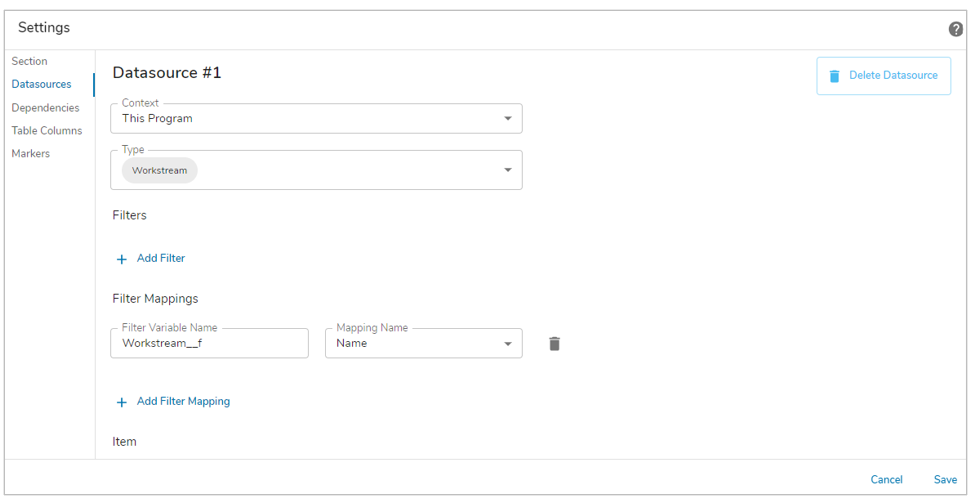
- Context: Defines the scope of content to be included on the Gantt.
| This <work item> | Descendants of the current work item will be retrieved into the chart. |
| From An Ancestor | Allows for selection of an ancestor template. Descendants of the ancestor work item will be retrieved into the chart.
Note: this option will not be available if there are no ancestors for the current template. |
| From Another App | Allows for reference to an explicit work item. Descendants of the identified work item will be retrieved into the chart. |
- Root Template: When a “From Another App” app name is selected as the Context, the content of the Gantt chart is scoped to descendants of a specific work item instance. The Root Template allows you to select the template of the work item instance.
- ID: When a “From Another App” app name is selected as the Context, the content of the Gantt chart is scoped to descendants of a specific work item instance. The ID allows you to specify the Shibumi-generated ID number for the specific work item.
- Type: Defines the descendant templates or backreference associations whose instances will populate the Gantt chart.
Default Filters
Defines filters that are applied to the retrieval of data for the chart. I.e., this filter is included in the database query to apply an initial filter to the retrieved content.
- Type: Defines the data type of the attribute which will be used for the filter logic. The selection made in the Type setting determines the options available in the Filter API Name field and determines which other settings are available.
- Filter API Name: The attribute whose value will be compared to the filter logic.
- Type = Text
- Default Filter Value: The value that must be matched to retrieve a record. Toggle between a text value or an expression resulting in the filter value by clicking on the text/expression icon at the right of the field.
- Type = SingleSelect
- Default Selection: The value that must be matched to retrieve a record.
- Type = MultiSelect
- Click the plus button to add filter fields. The filter criteria defined for a MultiSelect are applied as an “or” filter. Returned records must match at least one of the criteria but do not need to match all of the criteria.
- Option Value: The value that must be matched to retrieve a record.
- Type = Date
- Start Range Date: Toggle between a date value or an expression resulting in the date filter value by clicking on the text/expression icon at the right of the field. Returned work items must have a date value later than the value in this field. Note: a filter value must be entered into the End Date Range setting in order to define the date range.
- End Range Date: Toggle between a date value or an expression resulting in the date filter value by clicking on the text/expression icon at the right of the field. Returned work items must have a date value earlier than the value in this field. Note: a filter value must be entered into the Start Date Range setting in order to define the date range.
- Notes
- For Text, SingleSelect, and MultiSelect, when comparing against a name/value picklist attribute, the default comparison will be against the name.
- For SingleSelect and MultiSelect, do not include quotation marks around your entered text.
- Add Default Filter button: Click this button to add additional default filters. All defined default filters must be satisfied to retrieve a record.
Filter Mappings
If a Filter ID was specified on the Section page, the Filter Mappings section enables you to map the filter variables from the Filter section to the attributes that they should be applied to. I.e., define the attributes that will react to user-entered filter values.
Note: All filter fields included on the Filter section must be mapped on the Gantt settings.
If a Filter ID was not specified on the Section page (i.e., if it was left blank), the Filter Mappings section enables you to map the page-level filter variables to the attributes that they should be applied to. I.e., define the attributes that will react to the page-level filter values.
Whether from a Filter section or from page-level filters, the filter settings are:
- Filter Variable Name: Identifies the page-level filter variable that the attribute will react to.
- Mapping API Name: Defines the attribute that will be used to filter the content returned to the Gantt.
- Add Filter Mapping button: Click this button to add additional filters.
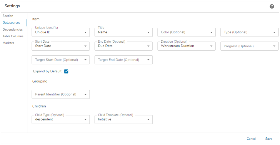
Item
Defines the display settings for the task (bar) or milestone (diamond) included on the Gantt chart.
- Unique Identifier: Provides a picklist of attributes to let you select the attribute that holds a unique identifier for the work item. A unique identifier is necessary to support dependency mapping.
- Note: A recommended implementation is to configure a calculated attribute to define a Unique ID for each work item.
- Title: Provides a picklist of attributes that allow you to define the attribute that will be displayed as a label for the bar/diamond.
- Bar Label: Available for datasources that have dependencies, choose from Title or Predecessor Name, this will display the selected value ahead of the bar as a hyperlink.
- Predecessor Label (Optional): Available for datasources that have dependencies, select an attribute to display for the predecessor, this will be hyperlinked to the respective work item.
- Optional Color: Provides a picklist of attributes that allow you to define the color that should be displayed for the Gantt bar/diamond. The selected attribute should resolve to a Hex code for a color (e.g., #000000 for black). If this setting is left empty, Shibumi will group using a black bar and will display all bars and diamonds blue.
- Note: a recommended implementation would define a calculated attribute that resolves to a hex code based on details of the work item (e.g., if the Urgency of a milestone is “High” the milestone bar color is red, hex code #ff0000, else the milestone bar color is blue, hex code #0000ff).
- Note: In order to utilize an Enterprise specific color, you must create a name/value picklist with a few different values. These would then need to be assigned via a calculated attribute that included your Enterprise’s hexcodes.
- Optional Type: Provides a picklist of attributes that allow you to define the Gantt object type that should be displayed. The selected attribute should resolve to either “task” or “milestone” (lowercase, no quotations around the value). A task will be displayed as a bar on the Gantt chart. A milestone will be displayed as a diamond.
- Note: a recommended implementation would define a calculated attribute that resolves to either task or milestone based on details of the work item (e.g., if the duration of time between the start and end dates is zero, resolve to “milestone” else resolve to “task”).
- Start Date: A picklist of date attributes. The selection in this setting determines the Start Date for the bar or diamond.
- Note: selecting the OOTB startDate, dueDate, and finishDate attributes in the Start and End Date settings will not work. The values in these settings must be custom attributes.
- Optional End Date: A picklist of date attributes. The selection in this setting determines the End Date for the bar or diamond. If this setting is empty, the Gantt object will default to milestone and will be displayed as a diamond.
- Optional Duration: A picklist of numeric attributes. The selection in this setting indicates the duration (in days) between the Start and End dates.
- Note: a recommended implementation would define a calculated attribute that determines the duration between the Start and End dates included on the Gantt.
- Optional Progress: A picklist of percentage attributes. The selection in this setting indicates the percentage completed for a task.
- Expand by Default: If the item is being used as a Group level on the Gantt, select this checkbox to determine whether the grouped items should be expanded or collapsed when the Gantt section is loaded.
- Optional Target Start Date: A picklist of date attributes. The selection in this setting determines the Target Start Date for the bar. The Target Start Date will be represented by a shaded version of the bar behind the Actual Start Date.
- Optional Target End Date: A picklist of date attributes. The selection in this setting determines the Target End Date for the bar. The Target End Date will be represented by a shaded version of the bar behind the Actual End Date.
Grouping
Grouping of the content on the Gantt is optional.
- Parent Identifier: the unique identifier that maps to the parent item
- Notes:
- A recommended implementation would define a calculated attribute that is set to the Unique ID value of the parent item.
- A second Datasource or an attribute must be included to retrieve the parent items in order to have content to display at the group level.
Children
Optional settings to provide the ability to create new work items directly from the Gantt.
- Child Type:
- Descendant: if this option is selected, you then must select the Child Template to determine the type of instance that will be created.
- Association: if this option is selected, you then must select the Association template to determine the type of instance that will be created.
- Commonancestor: This option is obsolete and will be removed in a future version.
- Add Datasource button: Click this button to add an additional datasource. If multiple datasources are included, the content will be ordered by datasource within the Gantt chart.
- Note: if you want to include Grouping in the Gantt Chart, you need at least two datasources. The first datasource retrieves the Item content to be displayed as tasks and milestones. The second datasource or attribute retrieves the Grouping item content.
Dependencies
The Workplan Gantt allows you to define dependencies between predecessor and successor work items. The settings in this section define the type of dependency that can be established.
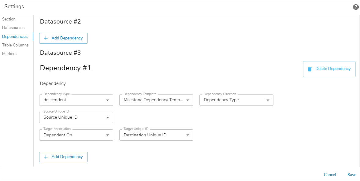
Dependency
- Dependency Type: select either descendent or association. If descendent, you will be prompted to identify the template that will be used to create descendent instances.
- Dependency Template: when a descendent dependency is established between two work items, an instance of this template is created as a child of the predecessor work item
- Note: A recommended implementation for this template would include an attribute to define the Dependency Direction and an association attribute to define the Successor work item.
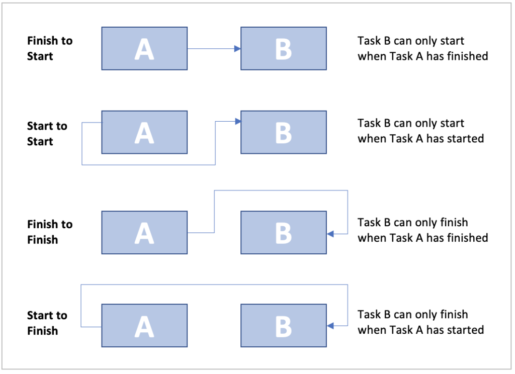
- Dependency Direction: should point to an attribute holding one of the following values: 0, 1, 2, 3. These values determine the behavior for the dependency (e.g., “finish_to_start”:”0″, “start_to_start”:”1″, “finish_to_finish”:”2″, “start_to_finish”:”3″ )
-
- Note: the Workplan Gantt provides a visualization of the dependencies but does not inherently enforce the dependency. If this is a requirement, add business logic to your solution to enforce the dependencies.
- Source Unique ID: the unique identifier for the predecessor
- Note: A recommended implementation would define a calculated attribute that builds a display-friendly Unique ID for the item. This not only enables the Dependency behavior but could also represent the hierarchical relationship of the work items (e.g., a Milestone within Initiative 237 might have a Unique ID formatted I237-M001).
- Target Association: the association attribute on the Dependency Template that points to the successor instance
- Target Unique ID: the unique identifier for the successor
- Note: A recommended implementation would define a calculated attribute that builds a display-friendly Unique ID for the item. This not only enables the Dependency behavior but could also represent the hierarchical relationship of the work items (e.g., a Milestone within Initiative 237 might have a Unique ID formatted I237-M001).
- Add Dependency button: Click this button to add an additional Dependency. To support the ability to define dependencies, a Dependency must be defined for the type of work item retrieved by a datasource and displayed on the Gantt (e.g., you can only define dependencies between milestones IF a Dependency has been configured to support this relationship).
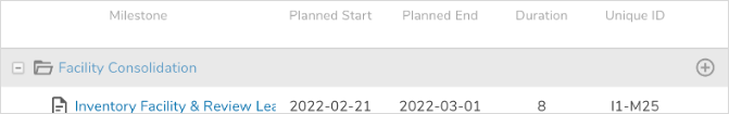
Table Columns
This section defines the columns displayed to the left of the Gantt chart.
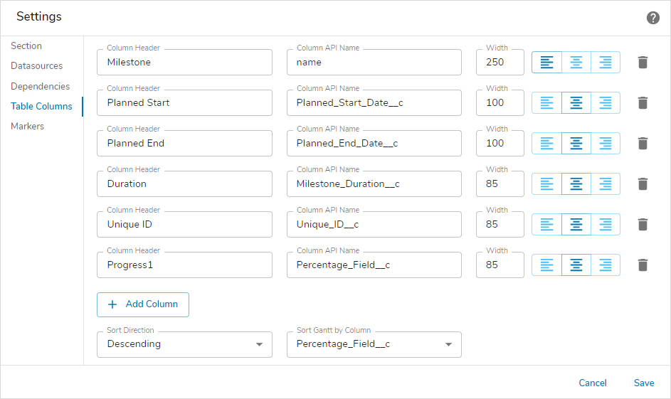
- Column Header: Text displayed in the header for the column.
- Column API Name: Attribute API name of the attribute value to be displayed in the column
- Note: Entering “text” in the API name column retrieves the work item name attribute and makes it a hyperlink. Entering “name” in the API name column retrieves the work item name attribute without making it a hyperlink.
- Width: Determines the static column width (pixels)
- Alignment: Determines whether the value should be left, right or center aligned.
- Delete Column button: Click the Trash can icon to delete the respective column.
- Add Column button: Click the Add Column button to add additional columns.
- Sort Direction: Select whether the sort direction is Ascending or Descending.
- Sort Gantt by Column: Select a specific Column to sort the entire Workplan Gantt Chart by.
- Notes:
- The Workplan Gantt section can only retrieve values from the template specified on the Datasources tab (Descendant API Name setting).
- Date columns will be displayed in ISO date formats.
- The recommended minimum width for the left-most column is 250.
- Columns must be added in the desired left to right order. Once added, they cannot be dynamically re-ordered. To re-order, the columns must be deleted and re-added.
Markers
This section allows you to define date markers that will be displayed as vertical lines on the Gantt chart.
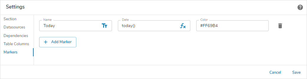
- Name: Determines the label displayed on the marker. Toggle between a text value or an expression resulting in the Name by clicking on the text/expression icon at the right of the field.
- Date: Determines the date on which the vertical marker will be displayed. Toggle between a date value or an expression resulting in the date by clicking on the text/expression icon at the right of the field.
- Color: Enter the hex color code that to define the color of the vertical marker.
6. Save the settings.
Note: There is no validation within the fields that accept expressions. If the expression is not entered correctly, the section will display an error on the instance, dashboard or presentation.
If the section is being configured on a template, publish and create an instance to view the customized Workplan Gantt Chart. If it’s being configured on a dashboard or presentation, click Stop Editing to view the rendered section.
Prerequisite
The Workplan Gantt section must be registered in the App.