
This is a Beta Release feature. Configuration and functionality may be modified before formal release.
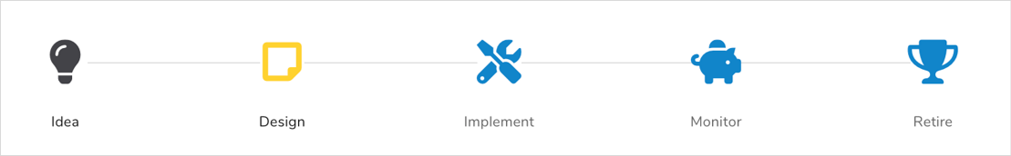
The Progress Bar section shows a visual representation of the progress towards a specified goal. The display of the Progress Bar is configurable when the section is added to a template, dashboard, or presentation.
Setup
To include a Progress Bar section in your solution:
- On a layout, dashboard, or presentation, from Configure mode, click Add Section.
- Select the Category of the Progress Bar section (this is configurable but is typically: Visualizations).
- Click on the Progress Bar option to add it to the layout.
- Click on the settings gear in the top right corner of the section to open the Settings dialog.
- Modify the settings to define the behavior of the Progress Bar:
- Section
- Title: A section title is optional. If there is no title, the Progress Bar contents will fill the full section real estate. Toggle between a text value or an expression resulting in the title by clicking on the text/expression icon at the right of the field.
- Orientation: Defines the orientation of the Progress Bar section, with options of horizontal (default) and vertical.
- Background Shape: By default, the Background Shape will be set to None. You have the option to set it to Circle, which will invert the color scheme so that the Icons are now white with a circle around them filled with selected color.
- Icon Size: A numeric value that sets the size for the series of icons within the Progress Bar.
- Steps
- Picklist: All Pick Lists defined on the Layout will be available for selection.
- Completed Color: Color selection panel that determines the color of the step icon when the step has been completed. At the bottom of the panel, toggle between a text value or an expression resulting in the hexadecimal code by clicking on the text/expression icon at the right of the field.
- Active Color: Color selection panel that determines the color of the step icon when the step has been set to active. At the bottom of the panel, toggle between a text value or an expression resulting in the hexadecimal code by clicking on the text/expression icon at the right of the field.
- Future Color: Color selection panel that determines the color of the step icon when the step has been set to a future date. At the bottom of the panel, toggle between a text value or an expression resulting in the hexadecimal code by clicking on the text/expression icon at the right of the field.
- Display: A checkbox that determines whether the step will be displayed on the Progress Bar.
- Name: Non-editable from the settings’ dialog, defines the name of the step. These names are inherited form the Pick List selection made above.
- Label: Editable field that defines the text that will appear below respective icon on the Progress Bar. Toggle between a text value or an expression resulting in the step label by clicking on the text/expression icon at the right of the field.
- Icon: The icon displayed for the respective step. The icons that are accepted into this setting are the free icons from the Font Awesome Library. Toggle between a text value or an expression resulting in the icon name by clicking on the text/expression icon at the right of the field.
- Section
- Save the settings. If the section is being configured on a template, publish and create an instance to view the customized Progress Bar. It it’s being configured on a dashboard or presentation, click Stop Editing to view the rendered section.
Notes:
- The maximum number of steps that can be added to a Progress Bar is 15.
- As a best practice, it is recommended that Progress Bar sections are not used on a Mobile tab.
- There is no validation within the fields that are expressions. If the expression is not entered correctly, the section will display an error on the instance, dashboard or presentation.
Prerequisite
The Progress Bar section must be registered in the App. Please contact your Shibumi Account team to complete the registration.