
Overview
This is a Beta Release feature. Configuration and functionality may be modified before formal release.
The Chart section supports a range of chart types so data can be displayed in a variety of ways.
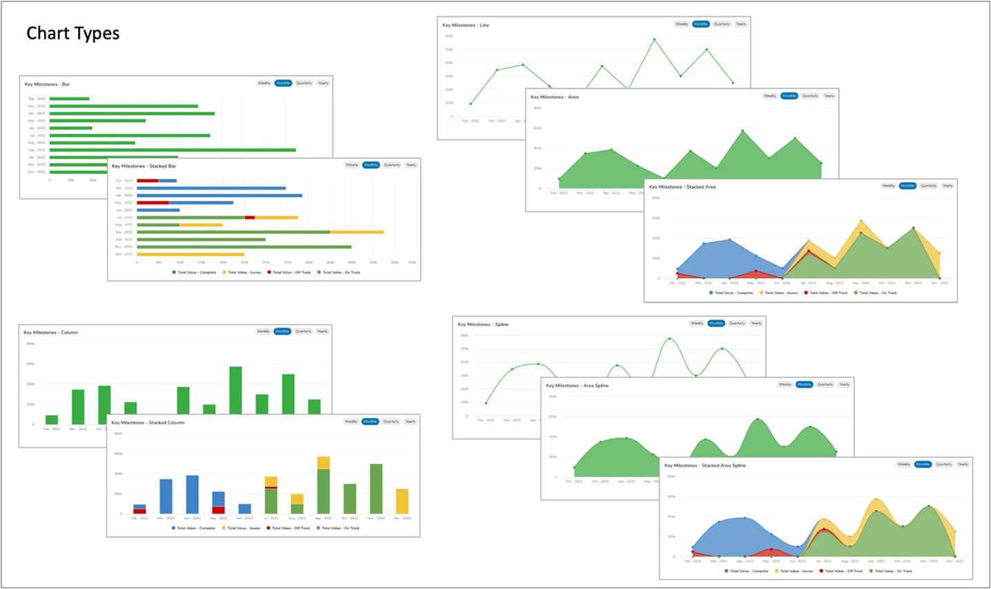
The Chart section is configurable when added to a template, dashboard, or presentation. With the chart section you have access to ten unique chart types.
- Area
- Stacked Area
- Spline
- Area Spline
- Stacked Area Spline
- Bar
- Stacked Bar
- Column
- Stacked Column
- Line
When reviewing charts, you can:
- Filter content on the chart by clicking on the data series displayed in the chart legend. This will toggle inclusion of the data series in the chart.
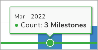
- Hover over any section of the chart to view a summary of the section’s data (especially helpful in stacked charts).
To include a Chart section in your solution:
- On a template, Dashboard or Presentation while in Configure mode, click Add Section.
- Select the Category of the Chart section (this is configurable but is typically: Visualizations).
- Click on the Chart option to add it to the layout.
- Switch to Configure edit mode and then click on the Settings gear in the top right corner of the section to open the Settings dialog.
- Modify the settings to define the desired chart type.
Section
The Section settings define basic information about the chart. 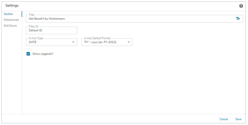
- Title: A section title is optional. If there is no title, the Chart contents will fill the full section real estate. Toggle between a text value or an expression resulting in the title by clicking on the text/expression icon at the right of the field.
- Filter Id: This setting is optional. If a Filter section is included on the same managed layout, the Chart can reference the Filter section. Any values entered on the filter section can be applied to the Chart content.
- Note: If you include a Filter section, all filter fields from the Filter section must be mapped as filters for the Chart. I.e., if you map only a subset of the Filter section fields, the Chart will not react to the Filter section values.
- X-Axis Type (filter): Determines whether the date filter options are displayed in the upper right corner of the chart.
- Notes:
- If TEXT is selected, the filter options will not be displayed on the chart.
- If DATE is selected, but then the X-Axis Type for the Datasource is set to TEXT, the filter options will be displayed but will not filter the chart content.
- X-Axis Default Format (filter): Defines the default selection for the date filter. This setting is only applicable if you select DATE as the X-Axis Type. The following formats are acceptable in this setting:
- MMM – yyyy (this is the default, e.g., Jan-2023)
- ‘W’ww – yyyy (e.g., W01-2023)
- ‘Q’Q – yyyy (e.g., Q1-2023)
- ‘FY’ – yyyy (e.g., FY-2023)
- Notes:
- If another date format is entered in the X-Axis Default Format setting, the chart will display the format on the X-Axis but when you click on the filter selections the format will be replaced with the format that matches the selected filter.
- If X-Axis Type = TEXT, the X-Axis Default Format setting will still be displayed but will be ignored.
- Show Legends?: Defines whether the Legend will be visible on the Chart section.
Datasources
This section defines the data to be included and the type(s) of charts to be displayed.
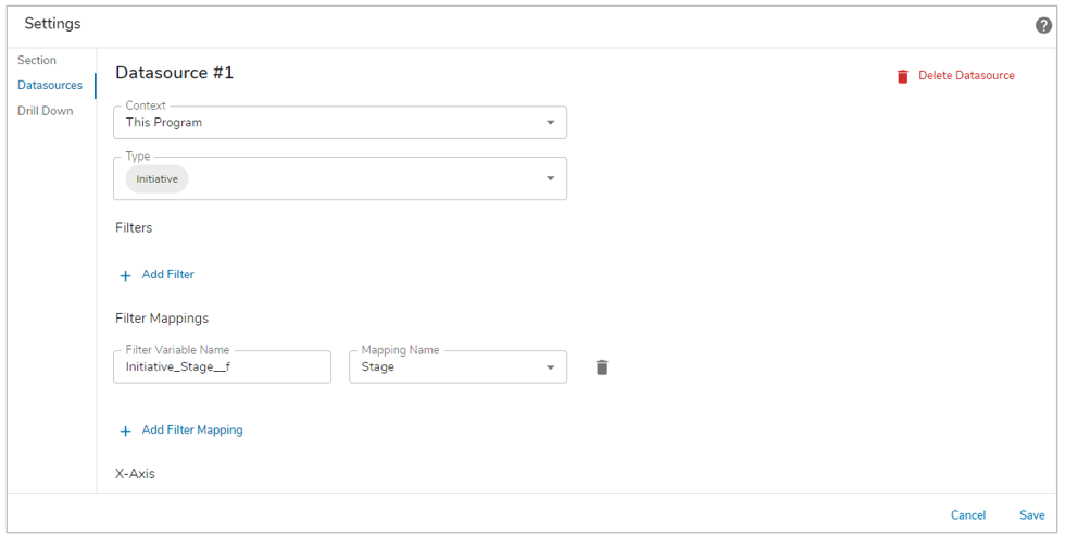
- Context: Defines the scope of content to be included in the Chart.
| This <work item> | Descendants or Associations of the current work item will be retrieved into the chart. |
| From An Ancestor | Allows for section of an ancestor template. Descendants or Associations of the ancestor work item will be retrieved into the chart.
Note: this option will not be available if there are no ancestors for the current template. |
- Type: Defines the descendant template(s) or backreference association(s) whose instances will populate the chart.
Note: When multiple template types are selected the attribute dropdowns are limited to shared attributes between the templates.
Filters
Defines filters that are applied to the retrieval of data for the chart. I.e., this filter is included in the database query to apply an initial filter to the retrieved content.
- Type: Defines the data type of the attribute which will be used for the filter logic. The selection made in the Type setting determines the options available in the Filter API Name field and determines which other settings are available.
- Filter API Name: The attribute whose value will be compared to the filter logic.
- Type = Text
- Default Filter Value: The value that must be matched to retrieve a record. Toggle between a text value or an expression resulting in the filter value by clicking on the text/expression icon at the right of the field.
- Type = SingleSelect
- Default Selection: The value that must be matched to retrieve a record.
- Type = MultiSelect
- Click the plus button to add filter fields. The filter criteria defined for a MultiSelect are applied as an “or” filter. Returned records must match at least one of the criteria but do not need to match all of the criteria.
- Option Value: The value that must be matched to retrieve a record.
- Type = Date
- Start Range Date: Toggle between a date value or an expression resulting in the date filter value by clicking on the text/expression icon at the right of the field. Returned work items must have a date value later than the value in this field. Note: a filter value must be entered into the End Date Range setting in order to define the date range.
- End Range Date: Toggle between a date value or an expression resulting in the date filter value by clicking on the text/expression icon at the right of the field. Returned work items must have a date value earlier than the value in this field. Note: a filter value must be entered into the Start Date Range setting in order to define the date range.
- Notes
- For Text, SingleSelect, and MultiSelect, when comparing against a name/value picklist attribute, the default comparison will be against the Name.
- For SingleSelect and MultiSelect, do not include quotation marks around your entered text.
- Add Default Filter button: Click this button to add additional default filters. All defined default filters must be satisfied to retrieve a record.
Filter Mappings
If a Filter ID was specified on the Section settings, the Filter Mappings section enables you to map the filter variables form the Filter section to the attributes that they should be applied to. I.e., define the attributes that will react to user-entered filter values.
- Note: If you include a Filter section, all filter fields from the Filter section must be mapped as filters for the Chart. I.e., if you map only a subset of the Filter section fields, the Chart will not react to the Filter section values.
If a Filter ID was not specified, the Filter Mappings section enables you to map the page-level filter variables to the attributes that they should be applied to. I.E., define the attributes that will react to the page-level filter values.
Whether a filter section or from page-level filters, the filter settings are:
- Filter Variable Name: Identified the page-level filter variable that the attribute will react to.
- Mapping Name: Defines the attribute that will be used to filter the content returned to the chart.
- Add Filter Mapping button: Click this button to add additional filters.
X-Axis
Defines the values displayed on the X-Axis of your chart.
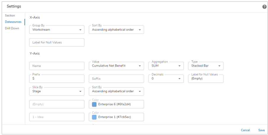
- Group By: Provides a picklist of available attribute names based on the Descendant or Association API Name Type setting on the Datasource to use as X-Axis values.
Y-Axis
Defines the values and display for the Y-Axis of your chart (e.g., sum of total revenue, count of milestones within a month, etc.).
- Name: Defines the name of the Y-Axis value (appears in the chart key found at the bottom of the chart and when a user hovers over the chart data).
- Note: With the removal of the automatically inserted hyphen and spaces on a Chart label, it can cause spacing issues within the label itself. To avoid this, enter a ” – ” within the Name field. Make sure to click off the field before selecting Save and Publish.
- Value: Provides a picklist of available attributes names (based on the Descendant or Association API Name Type setting on the Datasource) to use as Y-Axis values.
- Aggregation: Provides a picklist of aggregation options (i.e., SUM, MIN, MAX, COUNT, AVG). This setting defines how data associated with the selected Value is calculated and displayed on your chart.
- Type: Select the type of chart you’d like to have displayed for the Y-Axis value.
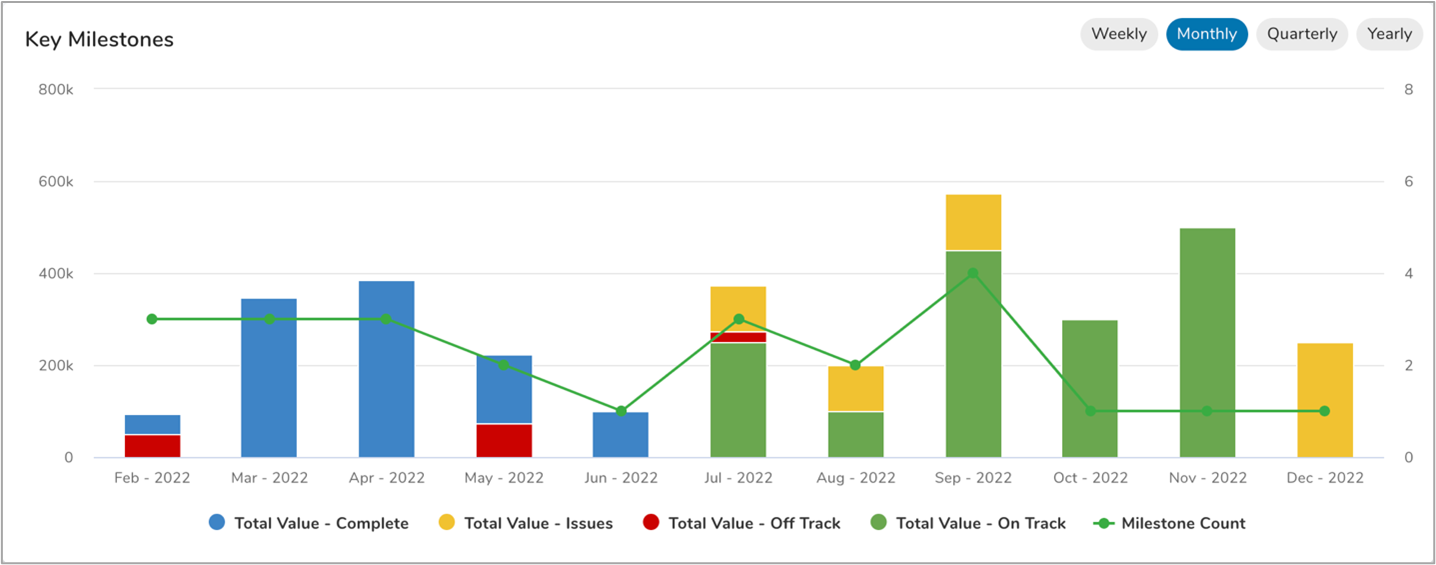
- Prefix: Define a prefix for the aggregated value displayed when you hover over sections of your chart. In the example provided below, the prefix is: “$”.
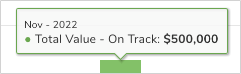
- Suffix: Defines a suffix for the aggregated value displayed when you hover over sections of your chart. In the example provided below, the suffix is: “Milestones”.
- Decimals: Defines the number of decimal places to include for the aggregated value on your chart. (Note: if you set Aggregation = COUNT, Decimals should be 0)
Stacked Charts
For any of the “stacked” chart Type options, additional settings will be displayed to enable you to define the “slices” included in the stack.
- Slice By Type: Provides a pick list with the options of DATE and TEXT. This setting defines whether to slice your chart’s Y-Axis values by a date (e.g., Due Date) or a text value (e.g., Status).
- Slice By: Provides a picklist of available attribute names (based on the Descendant or Association API Name Type setting on the Datasource) to slice your Y-Axis values. A best practice implementation for this setting would be to select a picklist attribute with a defined set of options.
- Slice Value: If you select a picklist attribute in the Slice By setting, a series of Slice Value (and Color Code) setting fields will be displayed representing each option from the pick list. The text in the Slice Value field matches the option name in the picklist and should not be changed.
- Color: If you select a pick list attribute in the Slice By setting, a series of Color (and Slice Value) setting fields will be displayed representing each option from the pick list. If the pick list is an icon/name/value pick list, the colors from the pick list options will default to the Enterprise Colors. You can keep the default values or replace them by selecting the field to open the Color Panel to choose a new color.
- Note: This setting allows you to specifically define the colors for each option in a pick list. This is a common requirement when the slice value is defined by the health of the work item (e.g., Red, Amber, Green health can be represented as Red, Amber, Green slices)
- Add Y-Axis Value: A single Chart section can include multiple Y-Axis values. Note: A best practice recommendation is to not include Bar or Stacked Bar charts with other Y-Axis charts as the orientation of the Bar charts is horizontal while other charts generally look better with a vertical orientation.
- Add Datasource: You can include multiple datasources in your chart section. This feature is useful, e.g., if you want to aggregate totals across work items from different templates.
Sort Order
The sort order for charts can be set to ascending or descending, either alphabetically or based on the order of option defined for the pick list.
- X-Axis: Open the settings dialog on a Custom Chart Section and navigate to the Datasources page. From the Group By field, select an option from the drop down menu. Then select the desired option for the Sort By.
- Y-Axis: Open the settings dialog on a Custom Chart Section and navigate to the Datasources page. Scroll to the Y-Axis group and select a “Stacked” type of chart as mentioned above. Then select a Slice by Field. The Sort By will update with related options based on the type of field selected (date, text or pick list).
- Notes:
- For charts with multiple datasources the Sort By that is selected with the first datasource will be applied to all datasources.
- For Charts sorted by pick list order, the order can be changed via the Attribute Details dialog accessed from the Data Panel.
Drill Down
The Drill Down feature allows users to view and understand how the aggregated value in the chart was derived. Select the checkbox on the Drill Down tab of the Settings dialog to enable it for the Chart.
The example below demonstrates how selecting a chart value will open the Drill Down dialog which displays the initiatives that are contributing to the value. Each initiative is hyperlinked and will open in a new tab.