
Overview
Gantt charts provide a view of your work items scheduled over time. For each work item, the chart displays:
- Work Item Name
- Start Date
- Due Date
- Status
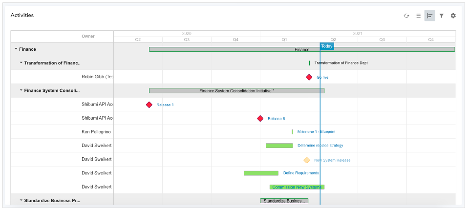
The colors of the Gantt chart bars correspond to the status of the work item. By default, if the work item bar is:
- Green: it is either completed or in progress but not past due
- Yellow: it is in progress with child items that are past due
- Red: it is in progress and past due
- Grey: it is not yet started or does not have a defined due date
Note: When a work item status has been manually overwritten, the color of the Gantt chart bar will match the override selection.
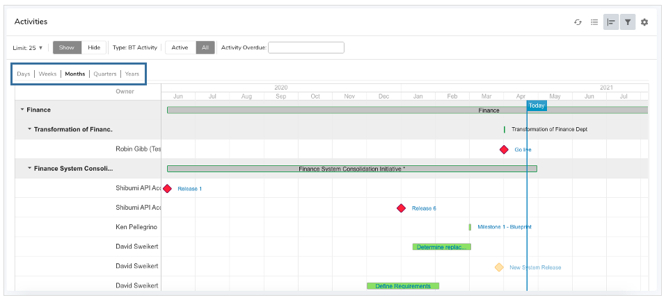
Gantt Timeframe Filter
Shibumi provides a filter selection to easily toggle through options to change the timeframe over which your Gantt chart is displayed.
- Click on the Filter funnel icon to open the filter bar.
- Modify the Gantt timeframe by clicking on the desired option at the top left of the chart.
Settings Dialog
Sections will only display the Gantt chart option if the Gantt chart has been enabled. You can enable the Gantt chart from the Settings dialog of a work item List or View section.
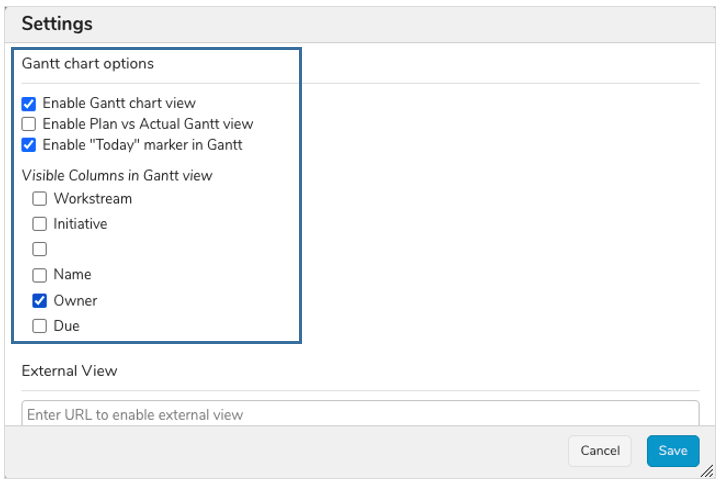
- Click on the Settings gear icon in the upper right corner of the section.
- Select the Enable Gantt chart view check box.
- Select other options to further define the Gantt chart behavior.
- Enable Plan vs Actual Gantt view: applicable if you are tracking planned and actual dates for your work items
- Enable “Today” marker in Gantt: displays a vertical line representing the current date on the Gantt chart
- Visible Columns in Gantt view: selected columns will be displayed in a left column of the Gantt chart. The available options are the columns displayed when the list / view section is displayed in Report view.
- Click the Save button.
Notes:
- You do not currently have the ability to define which dates the Gantt chart uses. It only accepts the Shibumi out-of-the-box Start date and Due date fields.
- You do not currently have the ability to modify the Gantt bar color logic. It only reflects the Shibumi out-of-the-box Status icon color.