
This is a Beta Release feature. Configuration and functionality may be modified before formal release.
The Set Value Button section shows a button that will assign a value to an attribute. A common usage of the button is to have the button assign a value to a field which in turn triggers a business rule that takes other actions on the work item (e.g., sets values to other fields, sends a notification, etc.). The display and behavior of the Set Value Button is configurable when the section is added to a template, dashboard, or presentation.

To include a Set Value Button section in your solution:
- On a layout, dashboard or presentation, from Configure mode, click Add Section.
- Select the Category of the Set Value Button section (this is configurable but is typically: Visualizations).
- Click on the Set Value Button option to add it to the layout.
- Click on the settings gear in the top right corner of the section to open the Settings dialog.
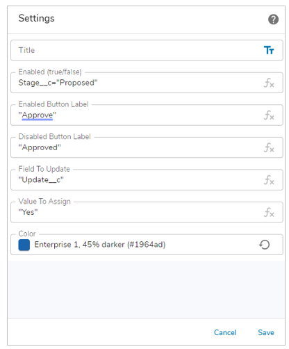
- Modify the settings to define the behavior of the Set Value Button.
- Title: A section title is optional. If there is no entry for this setting, the section will be displayed without a title. Toggle between a text value or an expression resulting in the title by clicking on the text/expression icon at the right of the field.
- Enabled (true/false): The expression that, when true, results in the button being enabled. The gray expression icon at the right of this setting field indicates that the entry must be an expression.
- Enabled Button Label: The text to display on the button when it is enabled. The gray expression icon at the right of this setting field indicates that the entry must be an expression.
- Disabled Button Label: The text to display on the button when it is disabled. The gray expression icon at the right of this setting field indicates that the entry must be an expression.
- Field to Update: The API name of the attribute to which the button click will set a value. The gray expression icon at the right of this setting field indicates that the entry must be an expression.
- Value to Assign: The value that is assigned to the data field. The gray expression icon at the right of this setting field indicates that the entry must be an expression.
- Button Color: Color selection panel that determines the button color. At the bottom of the panel, toggle between a text value or an expression resulting in the color code by clicking on the text/expression icon at the right of the field.
- Save the settings.
Notes:
- There is no validation within the fields that accept expressions. If the expression is not entered correctly, the section will display an error on the instance, dashboard or presentation.
- When the Enabled/Disabled setting is set to “” the button is disabled.
- If the Enabled/Disabled setting value is true, the button is enabled. If the setting value is false, the button is disabled.
If the section is being configured on a template, publish and create an instance to view the customized button. If it’s being configured on a dashboard or presentation, click Stop Editing to view the rendered section.
Prerequisite
The Set Value Button section must be registered in the App. Please contact your Shibumi Account team to complete the registration.