
Overview
The Branding Tab allows you to customize the logo, help links, and the theme (color palette) for your enterprise.
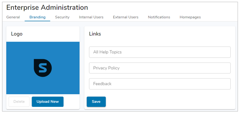
Logo
Provide a custom logo by uploading the image to be used into the logo section. Select the “Upload New” button to browse through your folders to find a suitable image. This logo will be displayed when the sidebar is expanded.
Note: Logo tip – use the company Twitter logo. Since it is a square, it often fits well.
Links
To customize the links in the navigation sidebar, enter custom URLs in the provided fields. You can choose from: All Help Topics, Privacy Policy, and Feedback links for implementation. Leave the fields blank to use Shibumi default links.
Theme
The Theme section allows you to configure the color of multiple elements within your solution, the data in your charts, and the Color Panel.
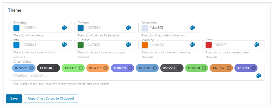
Note: Any Theme color can be reverted to the Default by clearing out the hex-code and saving.
Multiple elements can have their color configured to match a specific brand, below is a description of each and where the color change will be represented:
Branding
Defines the color of the Navigation Sidebar.
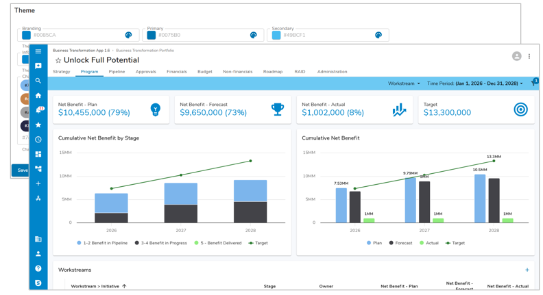
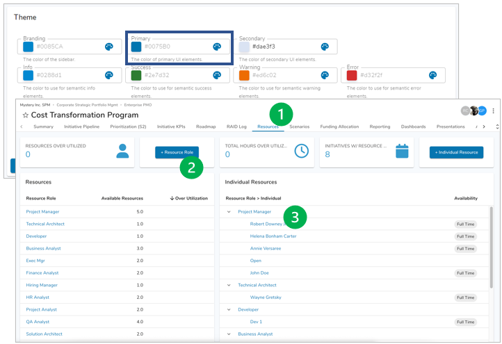
Primary
Defines the color of clickable UI elements such as Tabs, Buttons, Links, etc.
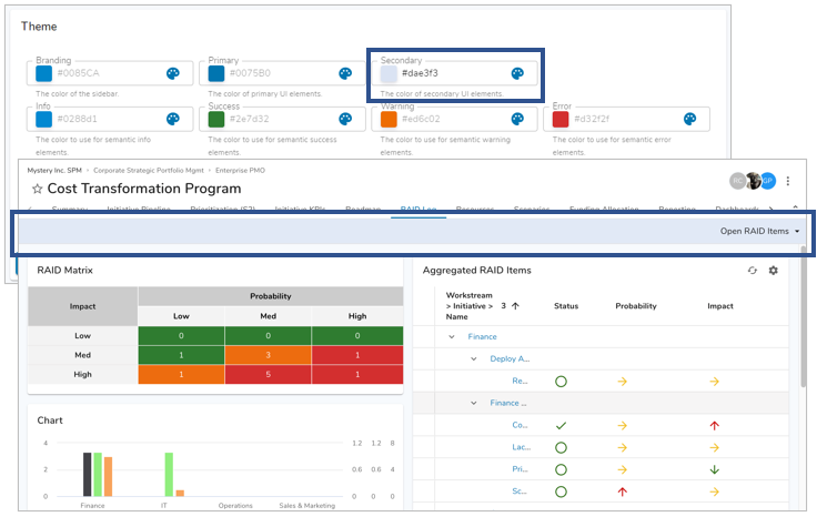
Secondary
A lighter variation of the Secondary Color is used for the Page Filter bar.
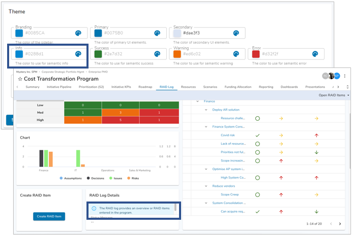
Info
Defines the color of any Information fields within forms and can be used in Alert sections.
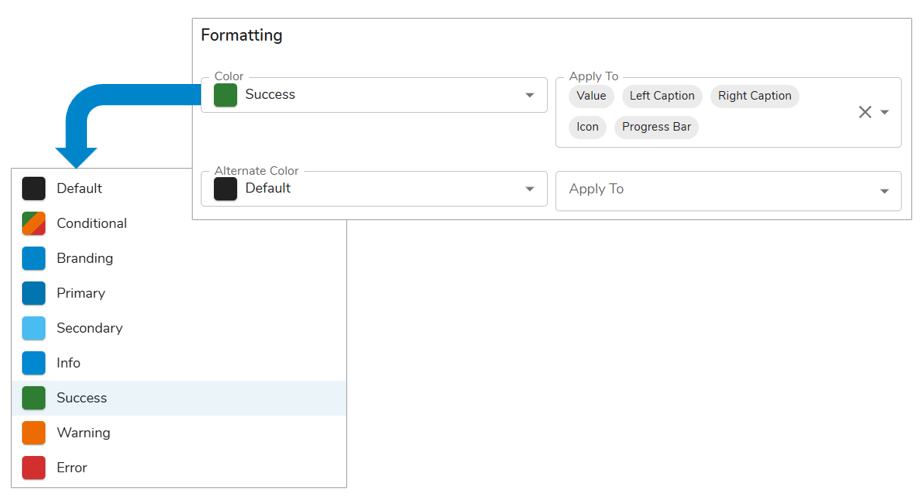
Success / Warning / Error
Defines colors used in success/error notifications, conditional formatting, and Alert sections.
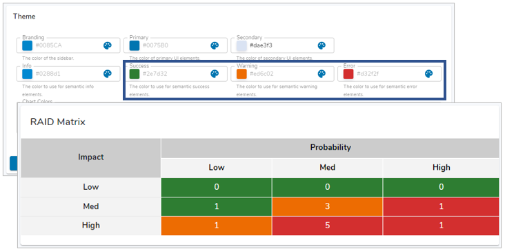
Chart Colors
- Enter Chart Colors to dictate what colors are used as the data series for your charts as well as defining the Enterprise Colors for the Color Panel to be used on Custom Sections.
- The order in which the color codes are entered determines the order of the data series colors and Enterprise Colors.
- Select “Copy Chart Colors to Clipboard” and paste into a document if you wish to change the order of the color codes.
- If no colors are selected, Shibumi colors will be used by default.
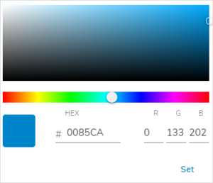
Note: If you do not have access to color codes, you can select the painter’s palette icon to open a separate UI to drag and drop to find the color you are looking for, as seen below.
Utilizing Branding Colors
Branding colors can be referenced throughout Shibumi to provide color to various elements. On sections, any ‘Color’ drop down field will provide the Branding Colors and any configured App Colors as options.
Notes:
- App Colors will only be displayed if they have been configured