
Overview
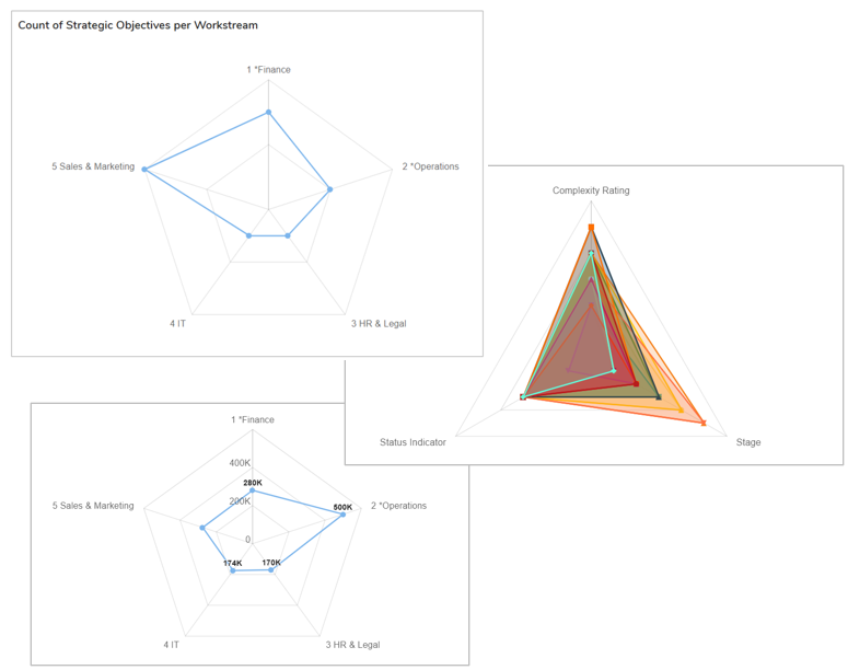
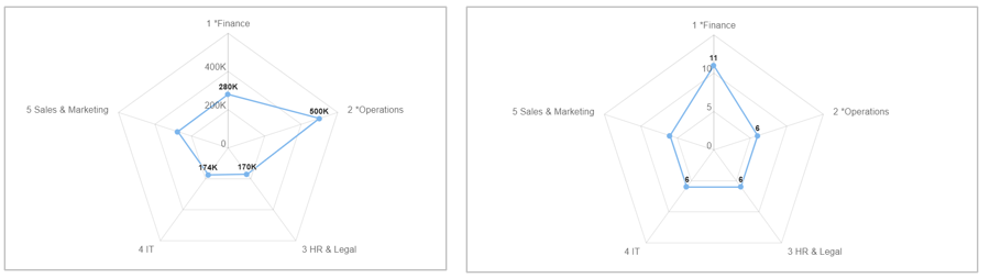
The Spider Chart enables teams to visualize and compare multiple dimensions in a single, intuitive way. By radiating categories from a central point, the chart quickly highlights patterns, strengths, and gaps. This makes it easier, e.g., for leaders to assess portfolio alignment to Strategic Objectives, identify under-represented focus areas, and understand overall execution health at a glance.
When reviewing charts, you can:
- Hover over any cell in the chart to view the value and respective location on the gradient scale.
- Click on any point on the chart for a drill down dialog.
- Export your chart as a PNG file by selecting the settings gear on the section and choosing the “Export” option.
Adding a Chart
- On a Layout or Dashboard in Configure mode, open the Add Section dialog.
- Select the Chart option from the left panel.
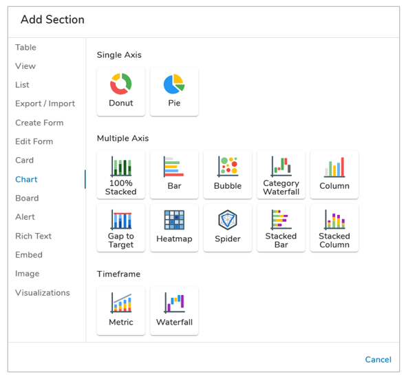
- Choose the Spider option under the Multiple Axis category. The chart will be added to the layout.
Configuring Spider Chart Settings
After successfully creating a new Chart section, follow the steps below to fully configure the section. These options can be edited on an existing Chart section via the Settings dialog whil in Configure mode on a layout.
Data
- Click on the Settings icon (gear) on the Section Controls of the Chart.
- Define the Datasource: the template(s) where the data is defined. In the Type field, open the drop-down menu to see all available templates. Select one or more templates to define the type.
- Optionally, locked Filters can be set when configuring a Chart section. These filters will apply to all content in the Chart and cannot be seen or edited by end users viewing the Chart. Page Filters can be referenced using the injected expression syntax: {!toFilter(API_Name__f)}. Refer to the Page Filtering article for more details on configuration.
- The Attribute drop-down menu will show attributes from the template(s) type selected. Select an Attribute.
- If the Attribute has Data Sets enabled, define the Data Set. Otherwise, it will default to ‘Actual’.
- Enter a value into the Value field. Filtering syntax can be found here.
- Add another filter by clicking Add Filter.
- Remove a filter by clicking the trash icon next to the filter.
Display
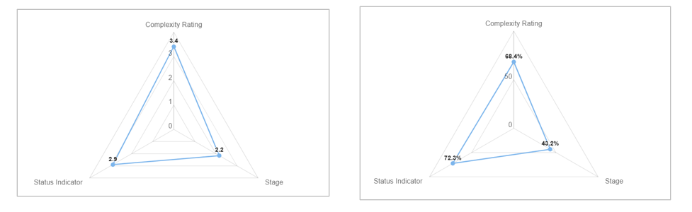
On the Display tab, you can select the values to display, format the values, and configure additional chart display options. The Spider Chart has two types: Outline and Fill. These only affect the display and can be freely toggled between.
Follow the steps below to configure the Chart Display, there are two Axes Types which can be configured for the Chart and will impact the overall configuration: Multiple Pick Lists or Association.
Multiple Pick List
Start by selecting the ‘Multiple Pick Lists’ within the Axes Type drop down.
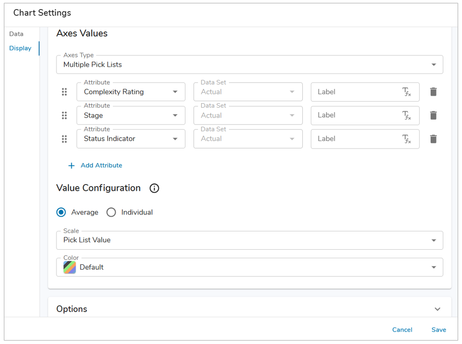
- In the Attribute drop down fields, choose from the available Pick List attributes from the defined template type (minimum of 3). Optionally, add additional Pick List attributes by selecting the ‘+ Add Attribute’ button.
- Define the Value Configuration for the Chart section.
- Average: one polygon for all work items of the defined template type. Optionally, define a color for the polygon of work items.
- Individual: one polygon for each work item of the defined template type.
- Define the Scale to be displayed for each point on the Chart.
- Pick List Value: displays the pick list value, either averaged or individually.
- Scaled Percentage: displays a percentage based on the current pick list value compared to the total number of pick list values, either averaged or individually.
- Optionally, define whether the Spider Chart will display values on the chart, include a legend, and/or have drill down enabled.
- Save and Publish your changes.
Association
Start by selecting the ‘Association’ within the Axes Type drop down. 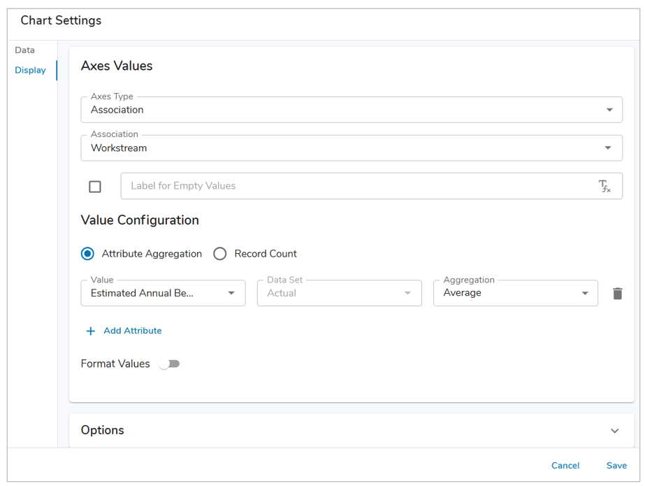
- In the Association drop down field, choose from the available Associations from the defined template type. Optionally, define a label for Empty Values.
- Define the Value Configuration for the Chart section.
- Attribute Aggregation: Select a Number, Metric, or Value Pick List attribute to display. Define the aggregation method. Optionally, add additional attributes by selecting the ‘+ Add Attribute’ button. Each defined attribute can be assigned a unique color via ‘Format Values’.
- Record Count: Provides a count of work items.
- Optionally, define whether the Spider Chart will display values on the chart, include a legend, and/or have drill down enabled.
- Save and Publish your changes.