
Overview
The Table section is an extremely performant display of work items (i.e., instances of a template) or associations. Tables can be configured to include editing of data or creation of new work items.
Table’s structure can vary based on their column and row definition, the table displayed in the following examples was derived from the same settings as the Configuring Table Sections article.
Column Types
Table Sections offer many configuration options based on their column and row structure; each option is described below.
Attribute Columns
Attribute Columns are used to display a work item’s attribute data.
Add Attribute Columns
- Click on the Customize option from the Table’s Section Controls.
- Click on the + Add Column button on the top right of the section, choose the Attribute option.
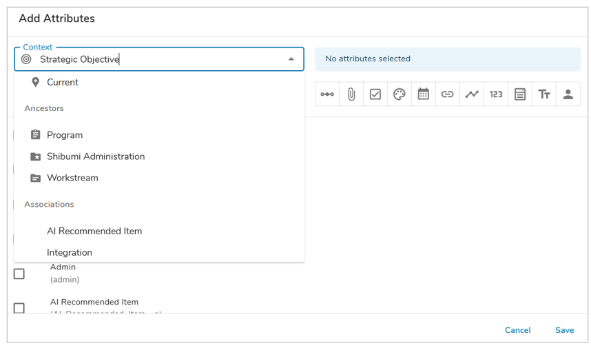
- The Add Attributes dialog will open allowing you to choose from existing attributes defined in the template(s). Choose from the Current template, an Ancestor, or Association within the Context dropdown.
- The available attributes will be provided based on the selected Context. The icons can be used to filter by category. You can also use the search bar to find an attribute.
- Select the checkbox of the attribute(s) you would like to add as a new column(s) and click Save at the bottom of the dialog. Note: the columns will be added in the same order they were selected.
- Save the section.
Configuring Attribute Columns
- In Customize mode, click on the column menu icon that appears when hovering over the column.
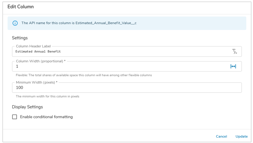
- Select Configure to display the Edit Column dialog.
- In the Column Header Label field, enter text or use an injected expression with the {!Attribute_API_Name__c} syntax to dynamically define the column header.
- Column Width: New columns will be set to Flexible by default. See the Resize Columns section for more details.
- Minimum Width: Setting for the minimum (pixel) width that the Table column will utilize.
- (If Pick List attribute) Define the Display Format for the column: (Icon or Icon & Name).
- Enable conditional formatting: Allows the definition of conditions to manipulate the formatting of the data displayed in the column. See Conditional Formatting for more information.
- Click Update.
- Save the section.
Configure Metric Columns
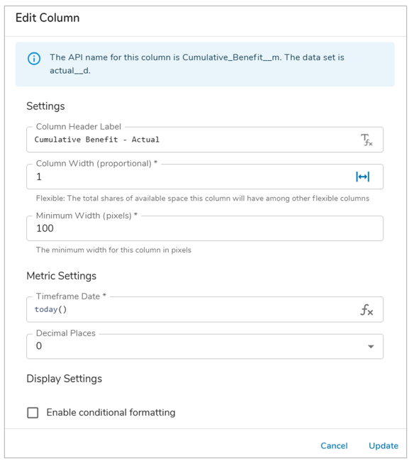
- In Customize mode, click on the column menu icon that appears when hovering over the column.
- Select Configure to display the Edit Column dialog.
- Enter the timeframe to display using the Shibumi Expression Language.
- E.g., Entering addMonths(today(),-6) for a monthly metric will display the metric value from 6 months ago.
- Metric Columns can reference Date and Date Range page filters. This allows you to dynamically set the timeframes for metric columns to quickly switch between dates displayed as the table data will immediately update as filters are changed. The process for this is described below:
- On a template, add page filters.
- In a table section, add metric columns, and select Configure in the column header menu to open the Edit column dialog.
- In the timeframe date field, enter an expression referencing the date and/or date range page filter(s). Repeat for all metric columns. Save the section.
- Define the number of decimal places to display via the dropdown menu.
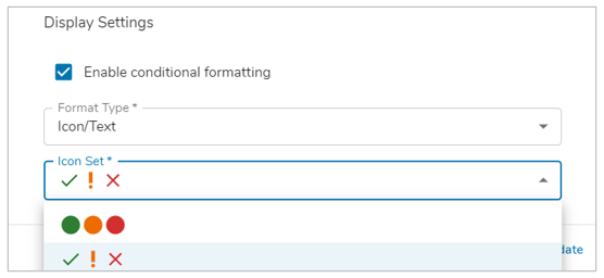
- Optionally, enable Conditional Metric Formatting for the column. This will apply the Success/Warning/Error branding colors to the row’s cells based on the value.
- In the Format Type drop down, define how the Conditional Formatting will be displayed for the column. Choose one of the following options: Background, Text, Icon, Icon/Text.
- Note: If Icon or Icon/Text is chosen, define the Icon Set that will be displayed within each cell.
- Click Update.
- Save the section.
Calculated Columns
Calculated Columns provide the ability to calculate and display a numeric value in a Table.
Adding and Configuring Calculated Columns
- Click on the Customize option from the Table’s Section Controls.
- Click on the + Add Column button on the top right of the section, choose the Calculation option.
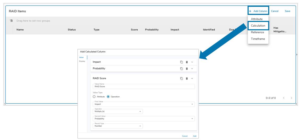
- Configure two Values with the Attribute value type, these will be used to create the calculation for the column. For a Metric attribute, define the Data Set and Timeframe.
- For the third Value, select Operation as the Value Type. Choose the two previously configured Values, define the Operator (+, -, x, /) and the Result Type (Number, Percentage, Currency) for the Value.
- On the Display tab, define the Value to Display (Operation). Configure the Decimal Places, Header Label and Width for the Column.
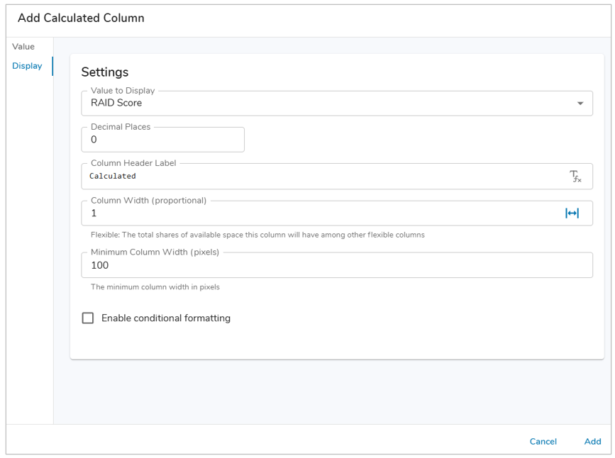
- Optionally, enable Conditional Formatting for the Column. If enabled, define the Format Type, Color, Value Condition, and any additional conditions.
- Select the Add button. Save the Table.
Note: Only Values with the Operation value type can be displayed in Calculated Columns, Calculated Columns can be edited to change their Values.
Reference Columns
Reference Columns are used to display a comma-delimited list of backreference associations or descendants.
Add Reference Columns
- Click on the Customize option from the Table’s Section Controls.
- Click on the + Add Column button on the top right of the section, choose the Reference option.
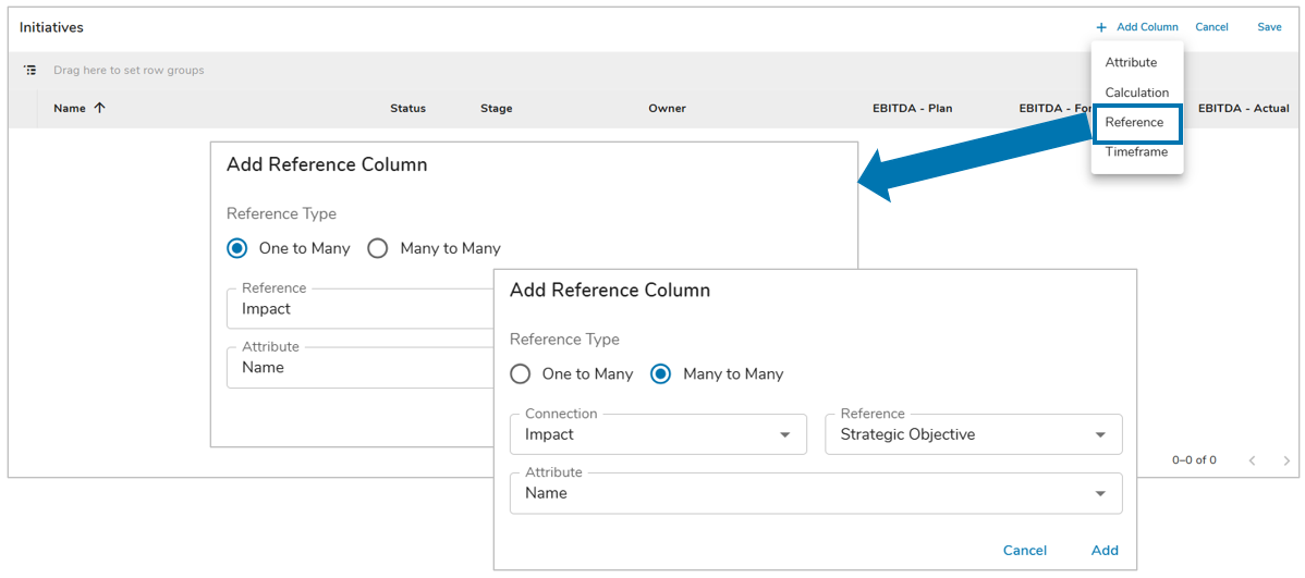
- For the Reference Type, select either One to Many or Many to Many.
- One to Many: From the Reference drop down, choose from available Direct Children, Descendants, or Associations. In the Attribute drop down, choose from Name, ID, or Outline Number (if enabled) to display as a comma-delimited list in the cell.
- Many to Many: Define the Connection by choosing from available Direct Children, Descendants, or Associations. Then from the Reference drop down, choose from available Direct Children, Descendants, or Associations. In the Attribute drop down, choose from Name, ID, or Outline Number (if enabled) to display as a comma-delimited list in the cell.
- From the Reference drop down, choose from available Direct Children, Descendants, or Associations. In the Attribute drop down, choose from Name, ID, or Outline Number (if enabled) to display as a comma-delimited list in the cell.
- Select the Add button. Save the Table.
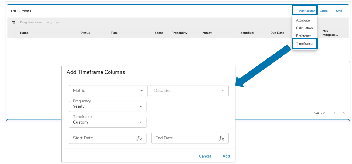
Metric Timeframe Columns
Metric Timeframe Columns are used to display metric data over a defined period of time.
Adding Metric Timeframe Columns
- Click on the Customize option from the Table’s Section Controls.
- Click on the + Add Timeframe button at the top right of the section.
- The Add Timeframe Columns dialog will open allowing you to choose from existing Metrics defined in the template(s).
- With a Metric selected, select the Data Set to display. If there is a Data Set Page Filter configured then it can be selected.
- Define the Frequency for the Metric Timeframe Column. Note: The Frequency preset options will be equal to or greater than the selected Metric’s Period of Measure.
- Finally, define the Timeframe. You can choose from any configured Date Range Page Filters or the Custom option which allows you to individually define the Start and End Dates with static dates or injected expressions.
- Select the Add button and Save the section. See Configure Metric Timeframe Columns below for more information.
Note: When adding a Metric Timeframe Column, the new column will display as a normal column. However, once you exit Customize mode the timeframe column header will appear above all others, with sub-columns below representing the frequency and timeframe of the metric data displayed.
Configure Metric Timeframe Columns
- In Customize mode, with a Metric Timeframe Column added to the table, click on the column menu icon on the that appears when hovering over the column.
- Select Configure to display the Edit Column dialog.
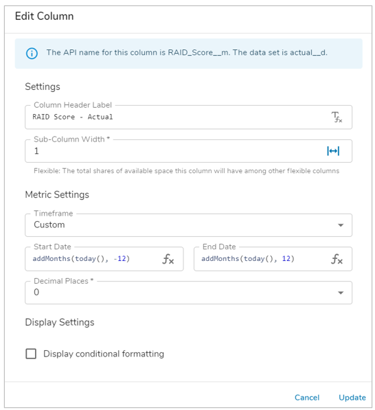
- Edit the Label and Sub-Column Width. The Width setting will be applied to the individual Sub-Columns.
- You can change the Timeframe by selecting the respective field. Choose between any configured Date Range Page Filters, available preset options, or define a Custom Timeframe.
- If Custom is selected for the Timeframe, the Start and End Dates for the timeframe must be defined.
- Define the Start/End Dates with a static date or by using the Shibumi Expression Language.
- E.g., Entering addMonths(today(),-6) for the Start Date and today() for the End Date of the Metric Timeframe will display the metric values from 6 months ago to today.
- Define the number of decimal places to display via the drop-down menu.
- (Optional) Enable Conditional Formatting for the Metric Timeframe Column. This will apply the Success/Warning/Error enterprise colors to the row’s cells based on the value.
- In the Format Type drop down, define how the Conditional Formatting will be displayed for the column. Choose one of the following options: Background, Text, Icon, Icon/Text.
- Note: If Icon or Icon/Text is chosen, define the Icon Set that will be displayed within each cell.
- Click Update.
- Save the section.
Note: If you have configured a dynamic timeframe that will produce a varying number of metric columns, ensure the appropriate Width setting has been selected. Fixed width may be necessary to ensure visibility of all columns for longer timeframes, while Flex width may work better for you when there’s are fewer columns or a fixed timeframe.
Conditional Formatting in Columns
Certain Columns within Table Sections can utilize Conditional Formatting when displaying data. Depending on the type of Column, a Default and/or Custom Conditional Formatting can be applied to the data.
Default Conditional Formatting
Default Conditional Formatting can be leveraged by Metric and data set-enabled Numeric columns within Table Sections. Defining the conditions for the Success/Warning/Error colors is done on the Attribute/Metric settings.
- On a Metric or data set-enabled Numeric column, select Configure to open the Edit Column dialog.
- At the bottom of the dialog toggle ‘Enable conditional formatting’.
- Define the Format Type (Background, Text, Icon, Icon/Text), ensure the ‘Default’ radio button is selected.
- The Success/Warning/Error conditions configured on the Number Attribute/Metric itself will be displayed.
- Update and Save the section.
Custom Conditional Formatting
Custom Conditional Formatting can be applied to individual numeric (attribute columns whose value is in a number format) columns, calculated columns, and Metric Timeframe columns within Table sections.
- On a Table section column, select Customize from the Section Controls.
- Open the column’s options and select Configure to open the Edit Column dialog. At the bottom of the dialog toggle ‘Enable conditional formatting’.
- Define the Format Type (Background, Text, Icon, Icon/Text) and select the ‘Custom’ radio button.
- Note: For Metric and data set-enabled Number attribute columns which have Conditional Formatting configured on the attribute, the Default option will initially be selected and display the defined Conditional Formatting conditions.
- Note: If Icon or Icon/Text is chosen, define the Icon Set that will be displayed within each cell.
- Define the first Condition’s color and the operator (>, >=, =, !=, <, <=) to compare the current attribute to another attribute/metric/static value.
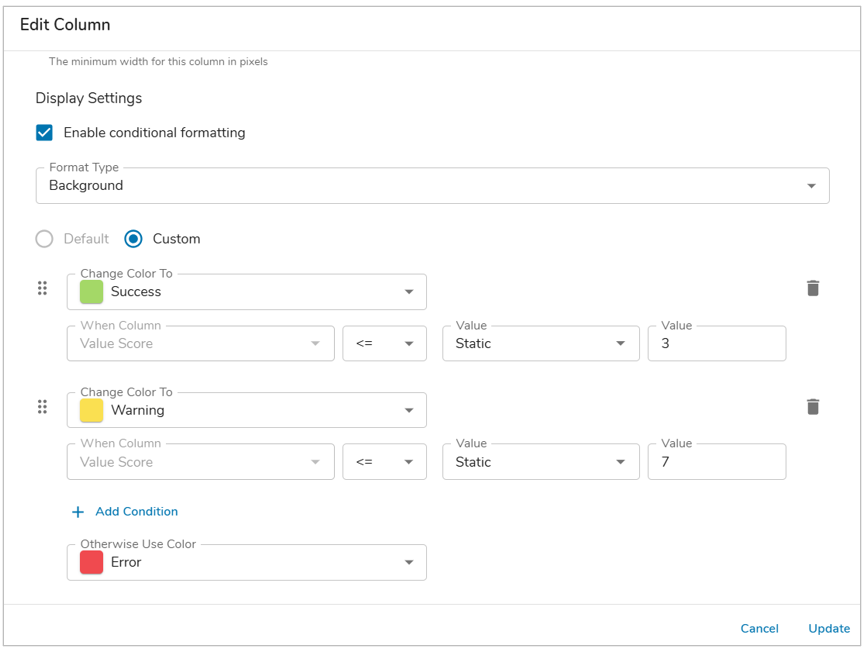
- In the Attribute field, select an attribute/metric or define a static value for comparison. A Data Set and Timeframe will need to be defined for any selected Metric attribute.
- Apply additional Conditions as desired.
- Define the ‘Otherwise Use Color’ from the available color options.
- Update and Save the section.
Managing Columns
In addition to configuring the settings of Columns, utilizing other aspects of the Column Options allows for custom manipulations of Columns in order to match a desired color, look, and flow of your Table Section. For more information on applying colors to Column Headers and Cells on a Table section, please visit the Configuring App Colors article.
Pin Columns
- In Customize mode, click on the column menu icon that appears when hovering over the column.
- Select Pin Column and choose whether to Pin Left or Pin Right.
- Save the section.
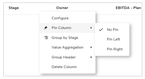
Notes:
- If there are multiple pinned columns, they can be reordered by dragging the columns.
- Flexible Width is not available on pinned columns.
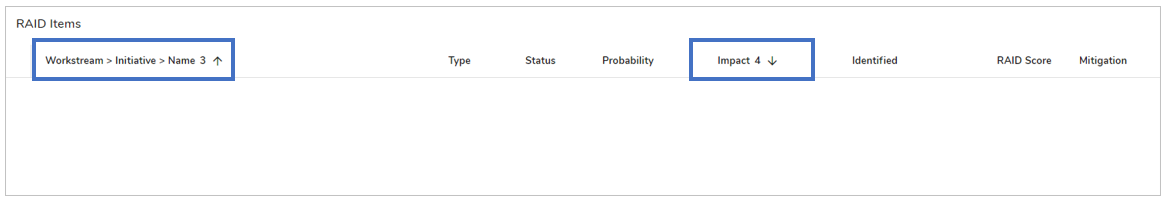
Sort Columns
- In Customize mode, click on a column header (do not click on the column menu icon that appears on hover). The sort icon will appear defaulting the column to sort in ascending order.
- Click the header again to toggle the sort order to descending.
- Clicking the header again will remove the sort option.
- To define multiple column sorting, hold down the Shift key on your keyboard and select additional columns by which to sort. A number will appear next to each sort selection to distinguish the order in which the columns will be sorted.
- Save the section.
Note:
- Column sorting defined in Customize mode will be the default sorting order end users will see upon loading the page. However, end users can change the sorting order/what is sorted freely. Upon page refresh the default sorting order will be restored.
- For multiple column sorting, the order of column selection determines the sorting priority. You must define ascending or descending sort order before clicking on the next column to include in the sort logic.
- Metric Timeframe Columns cannot be sorted while in Customize mode. Users can sort the sub-rows when interacting with the section.
Resize Columns
Columns can be resized in two ways:
- Through the Edit Column dialog:
- In Customize mode, click on the column menu icon that appears when hovering over the column
- Select Configure to display the Edit Column dialog.
- Edit the Column Width. Click the icon in the field to toggle between exact and flexible widths:
 Exact Width: Set a specific pixel value for the column.
-
-
- Flexible Width:
 Set the total shares of available space the column should have among other flexible columns. (Note: flexible width does not apply to pinned columns) E.g.,:
- In a Table with 5 columns, set all columns to flexible with the value of 1 so all columns are equal widths.
- In a Table with 5 columns, where 3 are exact widths, set one flexible column to 1 and one flexible column to 2 for the second column to take up twice as much space as the first (2/3rds of the space not taken up by the three exact width columns).
- Flexible Width Columns have a Minimum Width setting to ensure data is always readable while still providing the benefit of dynamically sizing to fit the horizontal width of the Table. The default Minimum Width will be set at 100 pixels.
- Flexible Width:
- Click Update.
- Save the section.
-
- By manually dragging the column border:
- In Customize mode, hover over the edge of a column to see the resizing cursor.
- Drag the column to its desired width.
- Save the section.
Reorder Columns
- In Customize mode, drag the column to the desired location.
- Save the section.
Group Rows
Table sections can be grouped by any column, with multiple groups nesting in a single column.
Rows can be grouped by columns in the Table in two ways:
- Selecting the option from the column menu:
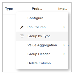
- In Customize mode, hover over the column that you will group by and click on the column menu icon.
- Select on the Group by (Column Name) option. The column name will appear in the grouping toolbar.
- Dragging columns into the grouping toolbar:
- Click and drag a column into the grouping toolbar.
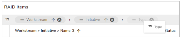
When grouping by multiple columns, you can rearrange the order by dragging the columns horizontally within the grouping toolbar.
The Group column will be named Group by default. This can be renamed to reflect groupings through the column Configure dialog, accessible through the column header menu.
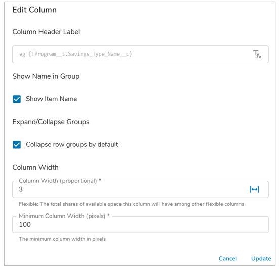
By default, the work item Name will appear within the Group column. This can be disabled by opening the column Configure dialog and deselecting the Show Name setting, if you choose to not display Name in the Table or prefer to display it in its own column.
The Expand/Collapse Groups checkbox defines whether all rows will be expanded or collapsed upon loading the Table Section. By default, the rows will be set to Expand.
Sort the Group column by clicking on the column header. Sort multiple levels of groups by clicking each column name in the grouping toolbar and holding the shift button on your keyboard.
Notes:
- Grouped columns can be removed by selecting the ‘X’ to the right of the column name within the grouping toolbar.
- Set the Table’s Height Setting to Fit to Window to avoid a paginated Table. This will ensure all content is visible in a single display and items within a group are not separated across multiple pages.
- On the instance, dashboard, or presentation slide, grouped Tables can be expanded or collapsed by end users.
Aggregate Columns
When columns are aggregated, a Total row appears at the bottom of the Table section. If columns are grouped, subtotals will be displayed in Group rows. 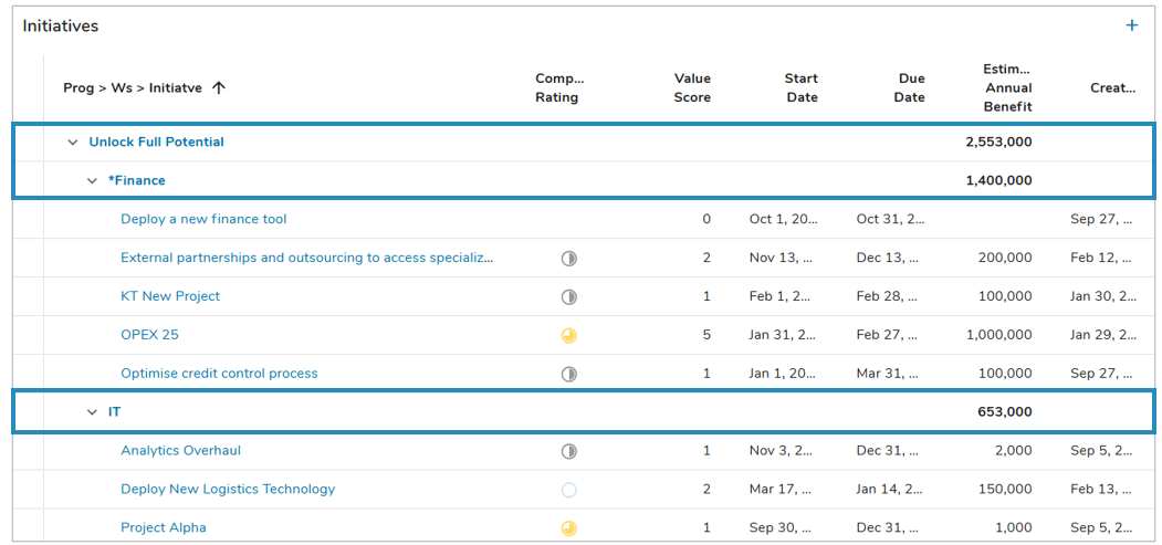
To aggregate columns:
- In Customize mode, click on the column menu icon that appears when hovering over the column.
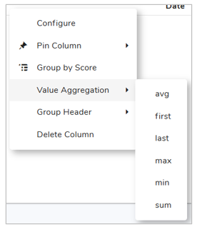
- Scroll to the Value Aggregation option. Aggregation methods for the column’s data type will be available. All available choices are as follows: clear (default), avg, first, last, max, min, sum.
- Select an aggregation option.
- Save the section.
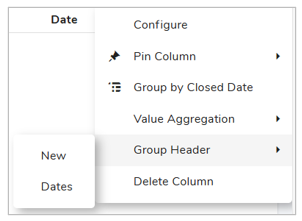
Group Headers
Grouped Headers provide the ability to group related columns under shared header labels, enabling thoughtful structuring of information in Table sections.
To Group Columns:
- While in Configure mode, select the ‘Customize’ option on a Table section.
- Click on the column menu icon and hover over the Group Header option. Select ‘New’ and define the new Group Label via text or injected expression within the dialog.
- Selecting ‘Add’ will create a new Grouped Header for the selected column.
- On a separate Column open the column menu and hover over Group Header. The previously created Grouped Header will be available as a selection, choose this option to add an additional column to the Grouped Header.
- Alternatively, select the ‘New’ option to add another Grouped Header to the Table section. To remove a column from a Grouped header, open the column menu and select ‘Remove From Group’.
- Save and Publish your changes.
Notes:
- Timeframe Columns cannot be included in Grouped Headers.
- Grouped Headers can be Pinned, which will pin the entire header (all columns within) to the selection. Right click on the Grouped Header to access the header configuration.
- The size of the Grouped Header is directly related to the defined size of the columns included in the header.
Emphasize Column
Emphasized Columns will have their content bolded and the respective Emphasis Cell color applied if the Table has App Table Colors enabled for the section. When a column is emphasized, the column header will receive the respective Emphasis Header color if the Table has App Table Colors enabled for the section.
To Emphasize Columns:
- While in Configure mode, select the ‘Customize’ option on a Table section.
- Click on the column menu icon and hover over the Emphasize option.
- Save and Publish your changes.
Delete Columns
Columns can be deleted in two ways:
- Through the column menu:
- In Customize mode, click on the column menu icon that appears when hovering over the column.
- Select Delete Column.
- Save the section.
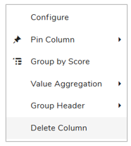
- By dragging the column out of the table:
- In Customize mode, drag the desired column out of the Table.
- Save the section.