
Overview
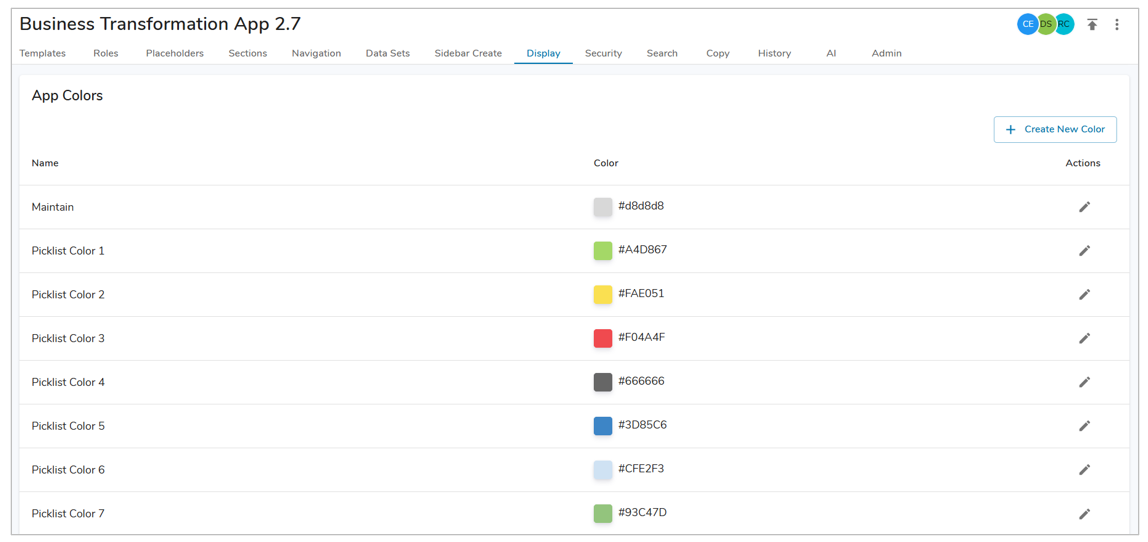
On the Display Tab, App Admins can name and define additional colors for use within section color configurations in the App. Each color row has a name, the hex code of the color, and an edit button. Additionally, Table Header & Column Colors can be defined for the solution.
Defining Table Header & Column Colors
App Admins can define standard header and column color formatting through the App Settings. Once the colors are defined, individual Table sections will need to enable App Table Colors for the colors to be applied.

- On the Display tab of an App, select one of the Column/Header drop downs.
- Define a color from the available Branding and/or App Colors for each of the various Table Header & Column Colors.
- Once the colors have been selected, click on the ‘Save’ button.
- Navigate to an existing Table section and open the Settings dialog.
- Select the ‘Enable App Table Colors’ checkbox. Save and Publish.
Enabling App Colors
In order for the App Colors to be displayed as an option in a Color drop-down on a section, they must first be defined by an App Admin.
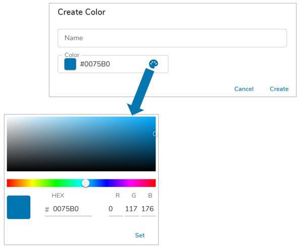
- On the Display tab in your App, select the ‘Create New Color’ button.
- Define the Name that will be displayed for the App Color.
- Enter the hex code in the color field, or choose from the palette by selecting the icon and clicking ‘Set’.
- Choose ‘Save’ to enable the App Color in the App.
Utilizing App Colors
When App Colors have been enabled in an App, they will be available for selection as the color for Card sections, Charts, Table Columns, and select Attribute configuration settings. A few key things to note when using App Colors within your solution:
- When an App Color is updated by an App Admin, the change will be displayed on the section immediately.
- Defined App Colors can be leveraged by the Table Header & Column Colors configuration.
- When an App color is reset to default (disabled), the section will update to display the original default color for the end users immediately. On the template, the color that has been disabled is no longer displayed as an option.
- On App Upgrade, all App Colors prior to upgrade will be overwritten.