
Overview
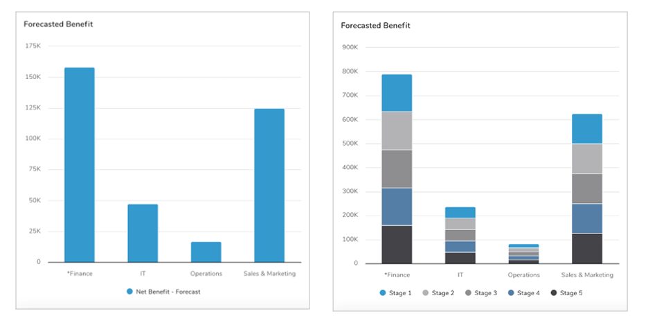
The Multiple Axis Column and Stacked Charts visualize data based on categories such as Region, Workstream, Lifecycle Stage, or Strategic Objective alignment. The X axis can be grouped by an Association, Checkbox attribute, Item Name, or Pick List attribute.

When reviewing charts, you can:
- Hover over any data series in the chart to view the values for that slice.
- Export your chart as a PNG file by selecting the settings gear on the section and choosing the “Export” option.
- Select the ‘Maximize’ button to make the chart full screen.
Adding a Chart
- On a layout in Configure mode, open the Add Section dialog.
- Select the Chart option from the left panel.
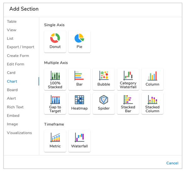
- Choose either the Bar/Column or Bar/Column Stacked option under the Multiple Axis category. The Chart will be added to the layout.
Configuring Chart Settings
After successfully creating a new Chart section, follow the steps below to fully configure the section. These options can be edited on an existing Chart section via the Settings dialog while in Configure mode on a layout.
Data
- Click on the Settings icon (gear) from the Section Controls on the Chart.
- Define the Datasource: the template(s) where the data is defined or the type(s) to count. In the Type field, open the drop-down menu to see all available templates. Select one or more templates to define the type.
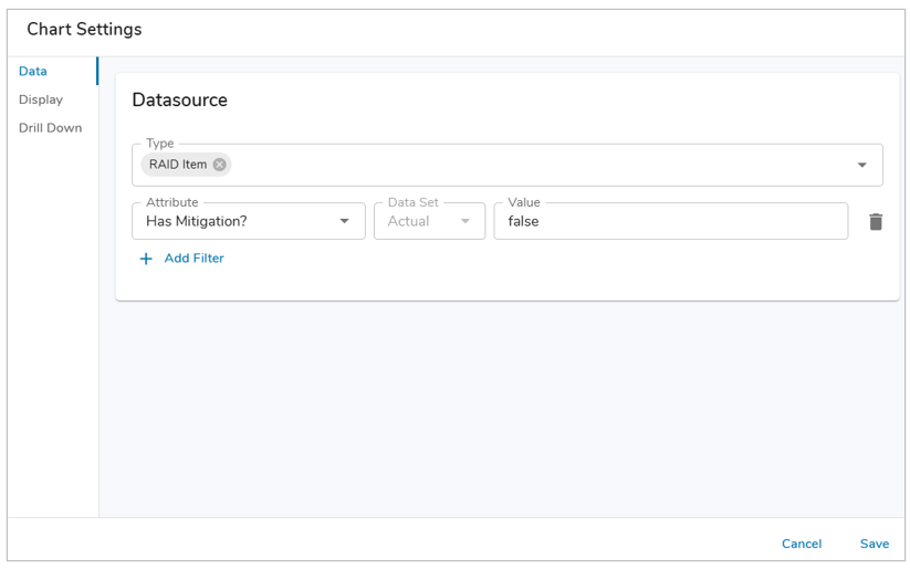
- Optionally, locked Filters can be set when configuring a Chart section. These filters will apply to all content in the Chart and cannot be seen or edited by end users viewing the Chart. Page Filters can be referenced using the injected expression syntax: {!toFilter(API_Name__f)}. Refer to the Page Filtering article for more details on configuration.
- The Attribute drop-down menu will show attributes from the template(s) type(s) selected. Select an Attribute.
- If the Attribute has Data Sets enabled, define the Data Set. Otherwise, it will default to ‘Actual’.
- Enter a value into the Value field. Filtering syntax can be found here.
- Add another filter by clicking Add Filter.
- Remove a filter by clicking the trash icon next to the filter.
Bar Chart Display
On the Display tab, you can adjust the type of Chart to display, define the aggregation type (Attribute Aggregation or Record Count), select the values to display (Attribute Aggregation), format the values, and configure additional chart display options.
Follow the steps below to configure the Chart Display:
- Select a Chart Type.
- Bar Chart: Displays a Bar Chart which allows you to define the aggregation type.
- Stacked Bar Stacked Chart: Displays a Stacked Bar Chart which will always aggregate to the sum of the defined value(s).
- Define the Y Axis (group by either Item Name, Association, Pick List attribute, Date attribute, or Checkbox attribute). Optionally, format these values to reorder, change labels or hide certain values.

- Determine the X Axis Bar Values in the Chart by selecting either Attribute Aggregation or Record Count. Add as many Values as desired by selecting the ‘+ Add Value’ option.
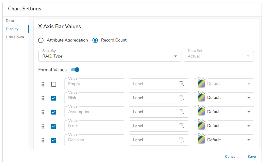
- Attribute Aggregation: Aggregate attribute/metric values from the specified template(s). Select the Attribute (Number, Name/Value Pick List, Name/Value/Icon Pick List) or Metric and Data Set. Define the Aggregation (Sum, Average, Minimum, Maximum). For Stacked Bar Charts, the Aggregation method will always be Sum.
- Record Count: Counts the total number of instances for the specified template(s).
- Select a Slice By from the drop-down menu. This setting determines the slices of the Chart. You can slice by Association, Item Name, Pick List or Checkbox. Depending on your selection, you will be able to format the values via the toggle.
- Sliced by Association: Enable the ‘Label for Empty Values’ checkbox to include items with empty Association values and define their Label & color.
- Sliced by Pick List: Pick List options can be re-ordered by clicking and dragging on the grabber icon. Individual Pick List options can be disabled from being displayed in the Chart by de-selecting the checkbox left of the Value. Labels and colors can be modified as well.
- Sliced by Checkbox: Options can be re-ordered by clicking and dragging on the grabber icon. Labels and colors can be set as well.
- When slicing by an Item Name or Association, the Out-of-the-box Color attribute will be used for the respective work item’s value in the chart.
- Note: If multiple Values are selected then the Slice By will be the Value Name.
- Under the Options accordion, you can define whether the chart values, total column, or labels are displayed at all times.

- Save and Publish your changes.
Column Chart Display
On the Display tab, you can adjust the type of Chart to display, define the aggregation type (Attribute Aggregation or Record Count), select the values to display (Attribute Aggregation), format the values, and configure additional chart display options.
Follow the steps below to configure the Chart Display:
- Select a Chart Type.
- Column Chart: Displays a Column Chart which allows you to define the aggregation type.
- Stacked Column Chart: Displays a Stacked Column Chart which will always aggregate to the sum of the defined value(s).
- Define the X Axis (group by either Item Name, Association, Pick List attribute or Checkbox attribute). Optionally, format these values to reorder, change labels or hide certain values.

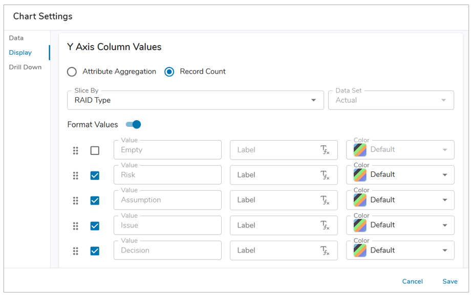
- Determine the Y Axis Column Values in the Chart by selecting either Attribute Aggregation or Record Count. Add as many Values as desired by selecting the ‘+ Add Value’ option.
- Attribute Aggregation: Aggregate attribute/metric values from the specified template(s). Select the Attribute (Number, Name/Value Pick List, Name/Value/Icon Pick List) or Metric and Data Set. Define the Aggregation (Sum, Average, Minimum, Maximum). For Stacked Column Charts, the Aggregation method will always be Sum.
- Record Count: Counts the total number of instances for the specified template(s).
- Select a Slice By from the drop-down menu. This setting determines the slices of the Chart. You can slice by Association, Item Name, Pick List or Checkbox. Depending on your selection, you will be able to format the values via the toggle.
- Sliced by Association: Enable the ‘Label for Empty Values’ checkbox to include items with empty Association values and define their Label & color.
- Sliced by Pick List: Pick List options can be re-ordered by clicking and dragging on the grabber icon. Individual Pick List options can be disabled from being displayed in the Chart by de-selecting the checkbox left of the Value. Labels and colors can be modified as well.
- Sliced by Checkbox: Options can be re-ordered by clicking and dragging on the grabber icon. Labels and colors can be set as well.
- When slicing by an Item Name or Association, the Out-of-the-box Color attribute will be used for the respective work item’s value in the chart.
- Note: If multiple Values are selected then the Slice By will be the Value Name.
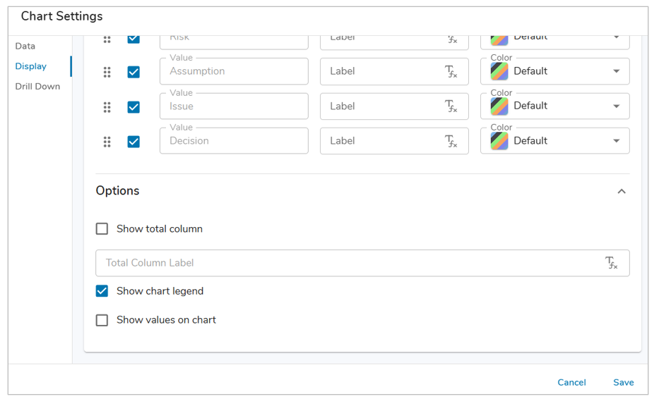
- Under the Options accordion, you can define whether the chart values, total column, or labels are displayed at all times.
- Save and Publish your changes.
Drill Down
Drill Down is always enabled on all Column and Stacked Column Multiple Axis Charts, displaying a table of work items based on the selected column or column slice.
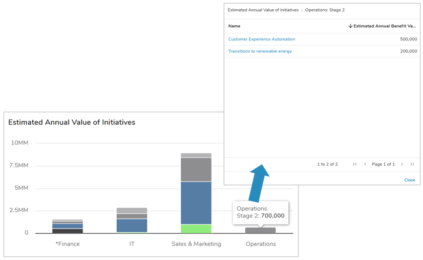
When selecting a column or column slice, the dialog of work items will display the selected option within the breadcrumb trail.
Additional capability is available in the form groupings, which will dynamically affect the display of the Chart section to help improve the ability to analyze program data in a single location.
- Open the Settings dialog of a Column/Stacked Column Chart and navigate to the Drill Down tab.
- Select the ‘+ Add Group By option’.
- In the Attribute field, choose from an Association, Checkbox, or Pick List.
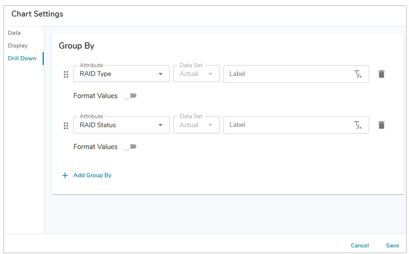
- Optionally, format any values as desired (Label, Color).
- Save.
Once groupings have been configured for a Column/Stacked Column Chart, selecting a slice will update the Chart to display the work items within the slice grouped by the defined attribute.
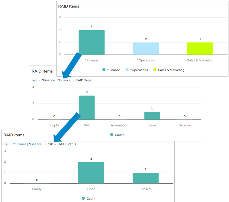
The breadcrumb trail appears on the chart as a user selects slices to drill into, indicating both the previous groups and the current selection, as seen in the example above. When selecting a slice on the final Group By, a dialog will open with a table of the work items.