
Overview
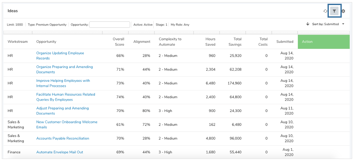
Vast amounts of data can be daunting to go through. Shibumi makes it easy to filter, sort, and export this data to easily digestible segments.
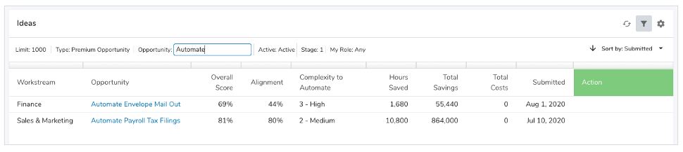
In any List or View of data, there is the ability to filter data by selecting the filter icon. The filter icon is located at the top right of the section. Clicking on it reveals the filter bar with the ability to type into or select values for unlocked filters. Typing text into a filter field will search for any items whose value contains that text.
Adding Filters
When you add a List or View section, the default filters for the listed/viewed template type are displayed.
To add additional filters:
- Click on the Settings icon (gear) at the top right of the Section.
- Select Customize.
- Click on the grey + sign on the right of the filters.
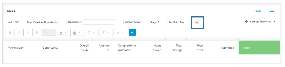
- The Add Filter dialog will be displayed. By default, you will see attributes and roles relating to the section context type. To view attributes and roles of an ancestor item, change the Context drop down at the top of the dialog.
- Select the check boxes to the left of the items to add them as filters.
- Click the Add button.
Notes:
- The order of your selection dictates the left to right order of the filters.
- Filters can be locked to prevent changes by end users by selecting the lock icon to the right of the field.
- Filters can be removed by selecting the X to the right of them.
Filter Types
Dropdown Filters
| Filter Name | Meaning |
| Limit |
|
| Type |
|
Text Filters
Text filters provide the ability to type a text value into the filter field to filter list/view content.
Toggle Filters
| Filter Name | Meaning |
| Active/All |
|
| Show/ Hide |
|
Filter Operators
Operators specify how filter criteria relate to one another. Refer to this list of filter operators when setting filters on Lists and Views.
| Action | Operator | Meaning | Supported Filter Type(s) |
| OR | Comma-separated (,) | Filters on any of the values entered | Text, Numeric |
| AND | Plus sign separated (+) | Filters on a combination of values | Text, Numeric |
| Exact Match | Surround values in quotes e.g. “Insert Values” | Returns results matching all entered values | Text, Numeric |
| Empty Values | Enter double quotes e.g. “” | Filters on fields containing no value | Text, Numeric |
| Less Than | < | Evaluates if a value is less than the value that follows this symbol | Numeric |
| Greater Than | > | Evaluates if a value is greater than the value that follows this symbol | Numeric |
| Less or Equal | <= | Evaluates if a value is less than or equal to the value that follows this symbol | Numeric |
| Greater or Equal | >= | Evaluates if a value is greater than or equal to the value that follows this symbol | Numeric |
| Not Equal to | != | Excludes values from your results | Text, Numeric |
Dynamic Filters
Admins and end users can define dynamic filters by entering injected expressions in a text or numeric filter. These allow you to provide an expression that determines the value that will be used for the filter.
An injected expression is composed of a brace, an exclamation point, an expression, and closed by a brace. These can be combined within a filter using a space, comma, or plus sign.
Examples:
- {!Stage__c}
- Project {!name}
- {!days(creationDate, finishDate)}
- {!max(10, Employee_Headcount__c)}
- {!Business_Unit__c} + {!Phase__c}
If you want to reference an ancestor attribute, you can do so by prefixing the reference with the template API name of the template containing the attribute. If the reference is to an attribute on the immediate parent or grandparent ancestor, you can use parent or parentOfParent as the prefix.
Examples:
- {!parent.Stage__c}
- {!parentOfParent.Stage__c}
- {!Initiative__t.Stage__c}
Attribute references in the dynamic filter expressions must use their API name, which can be found on the Data tab on a template.
Note: Exact filtering can be used for Dynamic Filters as well by surrounding the expression in double quotes, i.e. “{!Stage__c}”.